SENCE 2024 Examples
Sankey with different colors
Find color combinations at https://designwizard.com/blog/colour-combination/#gray-ff-and-lime-punch-dedff
In [1]:
Copied!
import matplotlib.pyplot as plt
from matplotlib.sankey import Sankey
fig = plt.figure()
ax = fig.add_subplot(1, 1, 1, xticks=[], yticks=[], title="Two Systems")
flows = [0.25, 0.15, 0.60, -0.10, -0.05, -0.25, -0.15, -0.10, -0.35]
sankey = Sankey(ax=ax, unit=None)
sankey.add(flows=flows, label='one',
orientations=[-1, 1, 0, 1, 1, 1, -1, -1, 0],
facecolor='#606060FF')
sankey.add(flows=[-0.25, 0.15, 0.1], label='two',
orientations=[-1, -1, -1], prior=0, connect=(0, 0),
facecolor='#D6ED17FF')
diagrams = sankey.finish()
diagrams[-1].patch.set_hatch('/')
plt.legend();

Read online CSV
In [2]:
Copied!
import pandas as pd
import pandas as pd
In [3]:
Copied!
pd.read_csv("https://python.ericduminil.com/files/wetterstation.temp.csv")
pd.read_csv("https://python.ericduminil.com/files/wetterstation.temp.csv")
Out[3]:
| #group | false | false.1 | true | true.1 | false.2 | false.3 | true.2 | true.3 | |
|---|---|---|---|---|---|---|---|---|---|
| 0 | #datatype | string | long | dateTime:RFC3339 | dateTime:RFC3339 | dateTime:RFC3339 | double | string | string |
| 1 | #default | mean | NaN | NaN | NaN | NaN | NaN | NaN | NaN |
| 2 | NaN | result | table | _start | _stop | _time | _value | _field | _measurement |
| 3 | NaN | NaN | 0 | 2024-03-31T22:00:00Z | 2024-11-12T21:56:11.652Z | 2024-04-01T07:38:29.058Z | 9.200975609756101 | value | wetterstation.temperatur |
| 4 | NaN | NaN | 0 | 2024-03-31T22:00:00Z | 2024-11-12T21:56:11.652Z | 2024-04-01T22:42:28.424Z | 8.58029850746268 | value | wetterstation.temperatur |
| ... | ... | ... | ... | ... | ... | ... | ... | ... | ... |
| 359 | NaN | NaN | 0 | 2024-03-31T22:00:00Z | 2024-11-12T21:56:11.652Z | 2024-11-10T19:18:43.354Z | 3.659710144927535 | value | wetterstation.temperatur |
| 360 | NaN | NaN | 0 | 2024-03-31T22:00:00Z | 2024-11-12T21:56:11.652Z | 2024-11-11T10:22:42.72Z | 1.9895384615384597 | value | wetterstation.temperatur |
| 361 | NaN | NaN | 0 | 2024-03-31T22:00:00Z | 2024-11-12T21:56:11.652Z | 2024-11-12T01:26:42.086Z | 5.282580645161291 | value | wetterstation.temperatur |
| 362 | NaN | NaN | 0 | 2024-03-31T22:00:00Z | 2024-11-12T21:56:11.652Z | 2024-11-12T16:30:41.452Z | 4.560792079207922 | value | wetterstation.temperatur |
| 363 | NaN | NaN | 0 | 2024-03-31T22:00:00Z | 2024-11-12T21:56:11.652Z | 2024-11-12T21:56:11.652Z | 2.4579310344827574 | value | wetterstation.temperatur |
364 rows × 9 columns
In [4]:
Copied!
pd.read_csv("https://python.ericduminil.com/files/wetterstation.temp.csv",
skiprows=3)
pd.read_csv("https://python.ericduminil.com/files/wetterstation.temp.csv",
skiprows=3)
Out[4]:
| Unnamed: 0 | result | table | _start | _stop | _time | _value | _field | _measurement | |
|---|---|---|---|---|---|---|---|---|---|
| 0 | NaN | NaN | 0 | 2024-03-31T22:00:00Z | 2024-11-12T21:56:11.652Z | 2024-04-01T07:38:29.058Z | 9.200976 | value | wetterstation.temperatur |
| 1 | NaN | NaN | 0 | 2024-03-31T22:00:00Z | 2024-11-12T21:56:11.652Z | 2024-04-01T22:42:28.424Z | 8.580299 | value | wetterstation.temperatur |
| 2 | NaN | NaN | 0 | 2024-03-31T22:00:00Z | 2024-11-12T21:56:11.652Z | 2024-04-02T13:46:27.79Z | 8.436757 | value | wetterstation.temperatur |
| 3 | NaN | NaN | 0 | 2024-03-31T22:00:00Z | 2024-11-12T21:56:11.652Z | 2024-04-03T04:50:27.156Z | 6.948889 | value | wetterstation.temperatur |
| 4 | NaN | NaN | 0 | 2024-03-31T22:00:00Z | 2024-11-12T21:56:11.652Z | 2024-04-03T19:54:26.522Z | 9.091223 | value | wetterstation.temperatur |
| ... | ... | ... | ... | ... | ... | ... | ... | ... | ... |
| 356 | NaN | NaN | 0 | 2024-03-31T22:00:00Z | 2024-11-12T21:56:11.652Z | 2024-11-10T19:18:43.354Z | 3.659710 | value | wetterstation.temperatur |
| 357 | NaN | NaN | 0 | 2024-03-31T22:00:00Z | 2024-11-12T21:56:11.652Z | 2024-11-11T10:22:42.72Z | 1.989538 | value | wetterstation.temperatur |
| 358 | NaN | NaN | 0 | 2024-03-31T22:00:00Z | 2024-11-12T21:56:11.652Z | 2024-11-12T01:26:42.086Z | 5.282581 | value | wetterstation.temperatur |
| 359 | NaN | NaN | 0 | 2024-03-31T22:00:00Z | 2024-11-12T21:56:11.652Z | 2024-11-12T16:30:41.452Z | 4.560792 | value | wetterstation.temperatur |
| 360 | NaN | NaN | 0 | 2024-03-31T22:00:00Z | 2024-11-12T21:56:11.652Z | 2024-11-12T21:56:11.652Z | 2.457931 | value | wetterstation.temperatur |
361 rows × 9 columns
In [5]:
Copied!
pd.read_csv("https://python.ericduminil.com/files/wetterstation.temp.csv",
skiprows=3,
parse_dates=[3, 4, 5])
pd.read_csv("https://python.ericduminil.com/files/wetterstation.temp.csv",
skiprows=3,
parse_dates=[3, 4, 5])
Out[5]:
| Unnamed: 0 | result | table | _start | _stop | _time | _value | _field | _measurement | |
|---|---|---|---|---|---|---|---|---|---|
| 0 | NaN | NaN | 0 | 2024-03-31 22:00:00+00:00 | 2024-11-12 21:56:11.652000+00:00 | 2024-04-01 07:38:29.058000+00:00 | 9.200976 | value | wetterstation.temperatur |
| 1 | NaN | NaN | 0 | 2024-03-31 22:00:00+00:00 | 2024-11-12 21:56:11.652000+00:00 | 2024-04-01 22:42:28.424000+00:00 | 8.580299 | value | wetterstation.temperatur |
| 2 | NaN | NaN | 0 | 2024-03-31 22:00:00+00:00 | 2024-11-12 21:56:11.652000+00:00 | 2024-04-02 13:46:27.790000+00:00 | 8.436757 | value | wetterstation.temperatur |
| 3 | NaN | NaN | 0 | 2024-03-31 22:00:00+00:00 | 2024-11-12 21:56:11.652000+00:00 | 2024-04-03 04:50:27.156000+00:00 | 6.948889 | value | wetterstation.temperatur |
| 4 | NaN | NaN | 0 | 2024-03-31 22:00:00+00:00 | 2024-11-12 21:56:11.652000+00:00 | 2024-04-03 19:54:26.522000+00:00 | 9.091223 | value | wetterstation.temperatur |
| ... | ... | ... | ... | ... | ... | ... | ... | ... | ... |
| 356 | NaN | NaN | 0 | 2024-03-31 22:00:00+00:00 | 2024-11-12 21:56:11.652000+00:00 | 2024-11-10 19:18:43.354000+00:00 | 3.659710 | value | wetterstation.temperatur |
| 357 | NaN | NaN | 0 | 2024-03-31 22:00:00+00:00 | 2024-11-12 21:56:11.652000+00:00 | 2024-11-11 10:22:42.720000+00:00 | 1.989538 | value | wetterstation.temperatur |
| 358 | NaN | NaN | 0 | 2024-03-31 22:00:00+00:00 | 2024-11-12 21:56:11.652000+00:00 | 2024-11-12 01:26:42.086000+00:00 | 5.282581 | value | wetterstation.temperatur |
| 359 | NaN | NaN | 0 | 2024-03-31 22:00:00+00:00 | 2024-11-12 21:56:11.652000+00:00 | 2024-11-12 16:30:41.452000+00:00 | 4.560792 | value | wetterstation.temperatur |
| 360 | NaN | NaN | 0 | 2024-03-31 22:00:00+00:00 | 2024-11-12 21:56:11.652000+00:00 | 2024-11-12 21:56:11.652000+00:00 | 2.457931 | value | wetterstation.temperatur |
361 rows × 9 columns
In [6]:
Copied!
pd.read_csv("https://python.ericduminil.com/files/wetterstation.temp.csv",
skiprows=3,
parse_dates=[3, 4, 5],
index_col='_time'
)
pd.read_csv("https://python.ericduminil.com/files/wetterstation.temp.csv",
skiprows=3,
parse_dates=[3, 4, 5],
index_col='_time'
)
Out[6]:
| Unnamed: 0 | result | table | _start | _stop | _value | _field | _measurement | |
|---|---|---|---|---|---|---|---|---|
| _time | ||||||||
| 2024-04-01 07:38:29.058000+00:00 | NaN | NaN | 0 | 2024-03-31 22:00:00+00:00 | 2024-11-12 21:56:11.652000+00:00 | 9.200976 | value | wetterstation.temperatur |
| 2024-04-01 22:42:28.424000+00:00 | NaN | NaN | 0 | 2024-03-31 22:00:00+00:00 | 2024-11-12 21:56:11.652000+00:00 | 8.580299 | value | wetterstation.temperatur |
| 2024-04-02 13:46:27.790000+00:00 | NaN | NaN | 0 | 2024-03-31 22:00:00+00:00 | 2024-11-12 21:56:11.652000+00:00 | 8.436757 | value | wetterstation.temperatur |
| 2024-04-03 04:50:27.156000+00:00 | NaN | NaN | 0 | 2024-03-31 22:00:00+00:00 | 2024-11-12 21:56:11.652000+00:00 | 6.948889 | value | wetterstation.temperatur |
| 2024-04-03 19:54:26.522000+00:00 | NaN | NaN | 0 | 2024-03-31 22:00:00+00:00 | 2024-11-12 21:56:11.652000+00:00 | 9.091223 | value | wetterstation.temperatur |
| ... | ... | ... | ... | ... | ... | ... | ... | ... |
| 2024-11-10 19:18:43.354000+00:00 | NaN | NaN | 0 | 2024-03-31 22:00:00+00:00 | 2024-11-12 21:56:11.652000+00:00 | 3.659710 | value | wetterstation.temperatur |
| 2024-11-11 10:22:42.720000+00:00 | NaN | NaN | 0 | 2024-03-31 22:00:00+00:00 | 2024-11-12 21:56:11.652000+00:00 | 1.989538 | value | wetterstation.temperatur |
| 2024-11-12 01:26:42.086000+00:00 | NaN | NaN | 0 | 2024-03-31 22:00:00+00:00 | 2024-11-12 21:56:11.652000+00:00 | 5.282581 | value | wetterstation.temperatur |
| 2024-11-12 16:30:41.452000+00:00 | NaN | NaN | 0 | 2024-03-31 22:00:00+00:00 | 2024-11-12 21:56:11.652000+00:00 | 4.560792 | value | wetterstation.temperatur |
| 2024-11-12 21:56:11.652000+00:00 | NaN | NaN | 0 | 2024-03-31 22:00:00+00:00 | 2024-11-12 21:56:11.652000+00:00 | 2.457931 | value | wetterstation.temperatur |
361 rows × 8 columns
In [7]:
Copied!
pd.read_csv("https://python.ericduminil.com/files/wetterstation.temp.csv",
skiprows=3,
usecols=['_time', '_value'],
parse_dates=[0],
index_col='_time',
)
pd.read_csv("https://python.ericduminil.com/files/wetterstation.temp.csv",
skiprows=3,
usecols=['_time', '_value'],
parse_dates=[0],
index_col='_time',
)
Out[7]:
| _value | |
|---|---|
| _time | |
| 2024-04-01 07:38:29.058000+00:00 | 9.200976 |
| 2024-04-01 22:42:28.424000+00:00 | 8.580299 |
| 2024-04-02 13:46:27.790000+00:00 | 8.436757 |
| 2024-04-03 04:50:27.156000+00:00 | 6.948889 |
| 2024-04-03 19:54:26.522000+00:00 | 9.091223 |
| ... | ... |
| 2024-11-10 19:18:43.354000+00:00 | 3.659710 |
| 2024-11-11 10:22:42.720000+00:00 | 1.989538 |
| 2024-11-12 01:26:42.086000+00:00 | 5.282581 |
| 2024-11-12 16:30:41.452000+00:00 | 4.560792 |
| 2024-11-12 21:56:11.652000+00:00 | 2.457931 |
361 rows × 1 columns
In [8]:
Copied!
df = pd.read_csv("https://python.ericduminil.com/files/wetterstation.temp.csv",
skiprows=3,
usecols=['_time', '_value'],
parse_dates=[0],
index_col='_time',
)
df = df.rename(columns={'_value': 'temperature'})
df
df = pd.read_csv("https://python.ericduminil.com/files/wetterstation.temp.csv",
skiprows=3,
usecols=['_time', '_value'],
parse_dates=[0],
index_col='_time',
)
df = df.rename(columns={'_value': 'temperature'})
df
Out[8]:
| temperature | |
|---|---|
| _time | |
| 2024-04-01 07:38:29.058000+00:00 | 9.200976 |
| 2024-04-01 22:42:28.424000+00:00 | 8.580299 |
| 2024-04-02 13:46:27.790000+00:00 | 8.436757 |
| 2024-04-03 04:50:27.156000+00:00 | 6.948889 |
| 2024-04-03 19:54:26.522000+00:00 | 9.091223 |
| ... | ... |
| 2024-11-10 19:18:43.354000+00:00 | 3.659710 |
| 2024-11-11 10:22:42.720000+00:00 | 1.989538 |
| 2024-11-12 01:26:42.086000+00:00 | 5.282581 |
| 2024-11-12 16:30:41.452000+00:00 | 4.560792 |
| 2024-11-12 21:56:11.652000+00:00 | 2.457931 |
361 rows × 1 columns
In [9]:
Copied!
df.plot();
df.plot();

In [10]:
Copied!
df.resample('1W').mean().plot();
df.resample('1W').mean().plot();

Include image in Notebook


Create output/ folder if needed
In [12]:
Copied!
from pathlib import Path
from pathlib import Path
In [13]:
Copied!
Path('output').mkdir(exist_ok=True)
Path('output').mkdir(exist_ok=True)
2-D Density Plot
In [14]:
Copied!
import numpy as np
import matplotlib.pyplot as plt
from scipy.stats import gaussian_kde as kde
# Create data: 200 points
data = np.random.multivariate_normal([0, 0], [[1, 0.5], [0.5, 3]], 200)
x, y = data.T
# Create a figure with 6 plot areas
fig, axes = plt.subplots(ncols=6, nrows=1, figsize=(21, 5))
# Everything starts with a Scatterplot
axes[0].set_title('Scatterplot')
axes[0].plot(x, y, 'ko')
# Thus we can cut the plotting window in several hexbins
nbins = 20
axes[1].set_title('Hexbin')
axes[1].hexbin(x, y, gridsize=nbins, cmap=plt.cm.BuGn_r)
# 2D Histogram
axes[2].set_title('2D Histogram')
axes[2].hist2d(x, y, bins=nbins, cmap=plt.cm.BuGn_r)
# Evaluate a gaussian kde on a regular grid of nbins x nbins over data extents
k = kde(data.T)
xi, yi = np.mgrid[x.min():x.max():nbins*1j, y.min():y.max():nbins*1j]
zi = k(np.vstack([xi.flatten(), yi.flatten()]))
# plot a density
axes[3].set_title('Calculate Gaussian KDE')
axes[3].pcolormesh(xi, yi, zi.reshape(xi.shape), cmap=plt.cm.BuGn_r)
# add shading
axes[4].set_title('2D Density with shading')
axes[4].pcolormesh(xi, yi, zi.reshape(xi.shape), shading='gouraud', cmap=plt.cm.BuGn_r)
# contour
axes[5].set_title('Contour')
axes[5].pcolormesh(xi, yi, zi.reshape(xi.shape), shading='gouraud', cmap=plt.cm.BuGn_r)
axes[5].contour(xi, yi, zi.reshape(xi.shape) );

Circular Barplot
Simple
In [15]:
Copied!
# import numpy to get the value of Pi
import numpy as np
# Add a bar in the polar coordinates
plt.subplot(111, polar=True);
plt.bar(x=0, height=10, width=np.pi/2, bottom=5);
# import numpy to get the value of Pi
import numpy as np
# Add a bar in the polar coordinates
plt.subplot(111, polar=True);
plt.bar(x=0, height=10, width=np.pi/2, bottom=5);

In [16]:
Copied!
import pandas as pd
# Build a dataset
df = pd.DataFrame(
{
'Name': ['item ' + str(i) for i in list(range(1, 51)) ],
'Value': np.random.randint(low=10, high=100, size=50)
})
# Show 3 first rows
df.head(3)
import pandas as pd
# Build a dataset
df = pd.DataFrame(
{
'Name': ['item ' + str(i) for i in list(range(1, 51)) ],
'Value': np.random.randint(low=10, high=100, size=50)
})
# Show 3 first rows
df.head(3)
Out[16]:
| Name | Value | |
|---|---|---|
| 0 | item 1 | 64 |
| 1 | item 2 | 70 |
| 2 | item 3 | 12 |
In [17]:
Copied!
# set figure size
plt.figure(figsize=(20,10))
# plot polar axis
ax = plt.subplot(111, polar=True)
# remove grid
plt.axis('off')
# Set the coordinates limits
upperLimit = 100
lowerLimit = 30
# Compute max and min in the dataset
max = df['Value'].max()
# Let's compute heights: they are a conversion of each item value in those new coordinates
# In our example, 0 in the dataset will be converted to the lowerLimit (10)
# The maximum will be converted to the upperLimit (100)
slope = (max - lowerLimit) / max
heights = slope * df.Value + lowerLimit
# Compute the width of each bar. In total we have 2*Pi = 360°
width = 2*np.pi / len(df.index)
# Compute the angle each bar is centered on:
indexes = list(range(1, len(df.index)+1))
angles = [element * width for element in indexes]
angles
# Draw bars
bars = ax.bar(
x=angles,
height=heights,
width=width,
bottom=lowerLimit,
linewidth=2,
edgecolor="white")

In [18]:
Copied!
import pandas as pd
import numpy as np
import matplotlib.pyplot as plt
import seaborn as sns
from matplotlib.lines import Line2D
from matplotlib import font_manager
import warnings
warnings.filterwarnings("ignore", category=RuntimeWarning)
import pandas as pd
import numpy as np
import matplotlib.pyplot as plt
import seaborn as sns
from matplotlib.lines import Line2D
from matplotlib import font_manager
import warnings
warnings.filterwarnings("ignore", category=RuntimeWarning)
In [19]:
Copied!
import tempfile
from pathlib import Path
import urllib
# Create a temporary directory for the font files
path = Path(tempfile.mkdtemp())
# URL and downloaded path of the fonts
url_label_font = "https://github.com/Lisa-Ho/small-data-projects/raw/main/assets/fonts/Ubuntu-R.ttf"
url_title_font = "https://github.com/Lisa-Ho/small-data-projects/raw/main/assets/fonts/Mandalore-K77lD.otf"
path_label_font = path / "Ubuntu-R.ttf"
path_title_font = path / "Mandalore-K77lD.otf"
# Download the fonts to our temporary directory
urllib.request.urlretrieve(url_label_font, path_label_font)
urllib.request.urlretrieve(url_title_font, path_title_font)
# Create a Matplotlib Font object from our `.ttf` files
label_font = font_manager.FontEntry(fname=str(path_label_font), name="Ubuntu-R")
title_font = font_manager.FontEntry(fname=str(path_title_font), name="Mandalore-K77lD")
# Register objects with Matplotlib's ttf list
font_manager.fontManager.ttflist.append(label_font)
font_manager.fontManager.ttflist.append(title_font)
In [20]:
Copied!
# load cleaned data set
df = pd.read_csv('https://raw.githubusercontent.com/Lisa-Ho/small-data-projects/main/2023/2308-star-wars-scripts/episode1_each_line_of_anakin_clean.csv')
# print first rows to check it's all looking ok
df.head()
# load cleaned data set
df = pd.read_csv('https://raw.githubusercontent.com/Lisa-Ho/small-data-projects/main/2023/2308-star-wars-scripts/episode1_each_line_of_anakin_clean.csv')
# print first rows to check it's all looking ok
df.head()
Out[20]:
| id | to | text | number | episode | |
|---|---|---|---|---|---|
| 0 | 271.0 | WATTO | Mel tassa cho-passa | 3 | 1 |
| 1 | 274.0 | PADME | Are you an angel? | 4 | 1 |
| 2 | 276.0 | PADME | An angel. I've heard the deep space pilots tal... | 46 | 1 |
| 3 | 278.0 | PADME | I listen to all the traders and star pilots wh... | 27 | 1 |
| 4 | 280.0 | PADME | All mylife. | 2 | 1 |
In [21]:
Copied!
# calculate corect angular position in circular bar plot
x_max = 2*np.pi
df['angular_pos'] = np.linspace(0, x_max, len(df), endpoint=False)
# calculate corect angular position in circular bar plot
x_max = 2*np.pi
df['angular_pos'] = np.linspace(0, x_max, len(df), endpoint=False)
In [22]:
Copied!
# store colors to use in dictionary
chart_colors = {'bg': '#0C081F', 'QUI-GON': '#F271A7', 'PADME': '#40B8E1', 'OBI-WAN':'#75EAB6',
'R2D2': '#F4E55E', 'other': '#444A68'}
# map colors for bars to the data
df['colors'] = df['to'].map(chart_colors)
# fill with neutral color for secondary characters
df['colors'] = df['colors'].fillna(chart_colors['other'])
In [23]:
Copied!
# layout -----------------------------------------
# setup figure with polar projection
fig, ax = plt.subplots(figsize=(10, 10),
subplot_kw={'projection': 'polar'})
# set background colors
ax.set_facecolor(chart_colors['bg'])
fig.set_facecolor(chart_colors['bg'])
# plot data -----------------------------------------
ax.bar(df['angular_pos'], df['number'], alpha=1, color=df['colors'],
linewidth=0, width=0.052, zorder=3)
# format axis -----------------------------------------
# start on the top and plot bars clockwise
ax.set_theta_zero_location('N')
ax.set_theta_direction(-1)
# scale y-axis to account for area size of bars
max_value = 50
r_offset = -10
r2 = max_value - r_offset
alpha = r2 - r_offset
v_offset = r_offset**2 / alpha
forward = lambda value: ((value + v_offset) * alpha)**0.5 + r_offset
reverse = lambda radius: (radius - r_offset) ** 2 / alpha - v_offset
ax.set_rlim(0, max_value)
ax.set_rorigin(r_offset)
ax.set_yscale('function', functions=(
lambda value: np.where(value >= 0, forward(value), value),
lambda radius: np.where(radius > 0, reverse(radius), radius)))
# format labels and grid
ax.set_rlabel_position(0)
ax.set_yticks([10,20,30,40])
ax.set_yticklabels([10,20,30,40],fontsize=9, color='white',alpha=0.35)
# format gridlines
ax.set_thetagrids(angles=[])
ax.grid(visible=True, axis='y', zorder=2, color='white',
linewidth=0.75, alpha=0.2)
# remove spines
ax.spines[:].set_visible(False)
# custom legend -----------------------------------------
# add axis to hold legend
lgd = fig.add_axes([0.75,0.71, 0.15, 0.25])
# define legend elements
kw = dict(marker='o', color=chart_colors['bg'], markersize=8, alpha=1,
markeredgecolor='None', linewidth=0)
legend_elements =[Line2D([0],[0],
markerfacecolor=chart_colors['PADME'],
label='Padme',
**kw),
Line2D([0], [0],
markerfacecolor=chart_colors['QUI-GON'],
label='Qui-Gon',
**kw),
Line2D([0], [0],
markerfacecolor=chart_colors['R2D2'],
label='R2D2',
**kw),
Line2D([0], [0],
markerfacecolor=chart_colors['OBI-WAN'],
label='Obi-Wan',
**kw),
Line2D([0], [0],
markerfacecolor=chart_colors['other'],
label='Other',
**kw)]
# visualise legend and remove axis around it
L = lgd.legend(frameon=False, handles=legend_elements, loc='center',
ncol=1, handletextpad=0.2, labelspacing=1)
plt.setp(L.texts, va='baseline', color='white', size=12,
fontfamily=label_font.name)
lgd.axis('off')
# circular annotation -----------------------------------------
# draw an inner circle on a new axis
circ = fig.add_axes([0.453, 0.435, 0.12, 0.12],polar=True)
line_angular_pos = df['angular_pos'][1:-5]
line_r = [5] * len(line_angular_pos)
#plot line and markers for start + end
circ.plot(line_angular_pos, line_r, zorder=5, color='white',
linewidth=0.75, alpha=0.4)
circ.plot(line_angular_pos.to_list()[0], line_r[0], zorder=5, color='white',
linewidth=0,marker='o', markersize=3,alpha=0.4)
circ.plot(line_angular_pos.to_list()[-1], line_r[-1], zorder=5, color='white',
linewidth=0,marker='>', markersize=3,alpha=0.4)
# format axis
circ.set_theta_zero_location('N')
circ.set_theta_direction(-1)
circ.axis('off')
# text annotations -----------------------------------------
ax.annotate('1 line', xy=(0.1, 48), xycoords='data', xytext=(40, 20),
textcoords='offset points',
fontsize=10, fontfamily=label_font.name,
ha='left', va='baseline',
annotation_clip=False,
color='#ababab',
arrowprops=dict(arrowstyle='->',edgecolor='#ababab',
connectionstyle='arc3,rad=.5', alpha=0.75))
ax.annotate('Words\nper line', xy=(-0.05, 22), xycoords='data', xytext=(0, 0),
textcoords='offset points',
fontsize=10, fontfamily=label_font.name,
ha='right', va='baseline',
annotation_clip=False,
color='#ababab')
ax.annotate('', xy=(-0.02, 38), xycoords='data', xytext=(0, -105),
textcoords='offset points',
fontsize=10, fontfamily=label_font.name,
ha='right', va='baseline',
annotation_clip=False,
color='#ababab',
arrowprops=dict(arrowstyle='<->',edgecolor='#ababab', linewidth=0.75,
connectionstyle='arc3,rad=0', alpha=0.75 ))
lgd.annotate('Talking to', xy=(0.35, 0.78), xycoords='data', xytext=(-18, 14),
textcoords='offset points',
fontsize=10, fontfamily=label_font.name,
ha='right', va='center',
annotation_clip=False,
color='#ababab',
arrowprops=dict(arrowstyle='->',edgecolor='#ababab',
connectionstyle='arc3,rad=-.5', alpha=0.75))
# Title + Credits -----------------------------------------
plt.figtext(0.5,1.03, 'Star Wars Episode I',
fontfamily=title_font.name,
fontsize=55, color='white', ha='center')
plt.figtext(0.5,0.98, 'Each line of Anakin',
fontfamily=label_font.name,
fontsize=24, color='white', ha='center')
plt.figtext(0.5,0.1, 'Data: jcwieme/data-scripts-star-wars | Design: Lisa Hornung',
fontfamily=label_font.name,
fontsize=8, color='white', ha='center', alpha=0.75)
plt.savefig('output/anakin.png')
plt.show()

Simple
In [24]:
Copied!
import matplotlib.pyplot as plt
import matplotlib.patches as mpatches # for the legend
from pywaffle import Waffle
import pandas as pd
import matplotlib.pyplot as plt
import matplotlib.patches as mpatches # for the legend
from pywaffle import Waffle
import pandas as pd
In [25]:
Copied!
data = {
2018: [3032, 2892, 804],
2019: [4537, 3379, 1096],
2020: [8932, 3879, 896],
2021: [22147, 6678, 2156],
2022: [32384, 13354, 5245]
}
df = pd.DataFrame(data,
index=['car', 'truck', 'motorcycle'])
data = {
2018: [3032, 2892, 804],
2019: [4537, 3379, 1096],
2020: [8932, 3879, 896],
2021: [22147, 6678, 2156],
2022: [32384, 13354, 5245]
}
df = pd.DataFrame(data,
index=['car', 'truck', 'motorcycle'])
In [26]:
Copied!
number_of_bars = len(df.columns) # one bar per year
# Init the whole figure and axes
fig, axs = plt.subplots(nrows=1,
ncols=number_of_bars,
figsize=(8,6),)
# Iterate over each bar and create it
for i,ax in enumerate(axs):
col_name = df.columns[i]
values = df[col_name] # values from the i-th column
Waffle.make_waffle(
ax=ax, # pass axis to make_waffle
rows=20,
columns=5,
values=values,
)
plt.show()

In [27]:
Copied!
number_of_bars = len(df.columns) # one bar per year
colors = ["darkred", "red", "darkorange"]
# Init the whole figure and axes
fig, axs = plt.subplots(nrows=1,
ncols=number_of_bars,
figsize=(8,6),)
# Iterate over each bar and create it
for i,ax in enumerate(axs):
col_name = df.columns[i]
values = df[col_name]/1000 # values from the i-th column
Waffle.make_waffle(
ax=ax, # pass axis to make_waffle
rows=20,
columns=5,
values=values,
title={"label": col_name, "loc": "left"},
colors=colors,
vertical=True,
icons=['car-side', 'truck', 'motorcycle'],
font_size=12, # size of each point
icon_legend=True,
legend={'loc': 'upper left', 'bbox_to_anchor': (1, 1)},
)
# Add a title
fig.suptitle('Vehicle Production by Year and Vehicle Type',
fontsize=14, fontweight='bold')
# Add a legend
legend_labels = df.index
legend_elements = [mpatches.Patch(color=colors[i],
label=legend_labels[i]) for i in range(len(colors))]
fig.legend(handles=legend_elements,
loc="upper right",
title="Vehicle Types",
bbox_to_anchor=(1.04, 0.9))
plt.subplots_adjust(right=0.85)
plt.show()

More complex
https://python-graph-gallery.com/web-waffle-chart-as-share/
NOTE: Example should be updated because pyfonts has been changed
In [28]:
Copied!
# Libraries
import matplotlib.pyplot as plt
import pandas as pd
from pywaffle import Waffle
from highlight_text import fig_text, ax_text
from pyfonts import load_font
# Libraries
import matplotlib.pyplot as plt
import pandas as pd
from pywaffle import Waffle
from highlight_text import fig_text, ax_text
from pyfonts import load_font
In [29]:
Copied!
path = 'https://raw.githubusercontent.com/holtzy/R-graph-gallery/master/DATA/share-cereals.csv'
df = pd.read_csv(path)
def remove_html_tag(s):
return s.split('</b>')[0][3:]
df['lab'] = df['lab'].apply(remove_html_tag)
df = df[df['type'] == 'feed']
df.reset_index(inplace=True)
df
path = 'https://raw.githubusercontent.com/holtzy/R-graph-gallery/master/DATA/share-cereals.csv'
df = pd.read_csv(path)
def remove_html_tag(s):
return s.split('')[0][3:]
df['lab'] = df['lab'].apply(remove_html_tag)
df = df[df['type'] == 'feed']
df.reset_index(inplace=True)
df
Out[29]:
| index | lab | type | percent | |
|---|---|---|---|---|
| 0 | 0 | Africa | feed | 21 |
| 1 | 2 | Americas | feed | 53 |
| 2 | 4 | Asia | feed | 32 |
| 3 | 6 | Europe | feed | 66 |
| 4 | 8 | Oceania | feed | 59 |
In [30]:
Copied!
#NOTE: URL has been updated
font_title = load_font("https://github.com/googlefonts/staatliches/raw/refs/heads/main/fonts/Staatliches-Regular.ttf")
font_credit = load_font("https://github.com/impallari/Raleway/raw/master/fonts/v4020/Raleway-v4020-Light.otf")
bold_font_credit = load_font("https://github.com/impallari/Raleway/raw/master/fonts/v4020/Raleway-v4020-Bold.otf")
background_color = "#222725"
pink = "#f72585"
dark_pink = "#7a0325"
number_of_bars = len(df) # one bar per continent
# Init the whole figure and axes
fig, axs = plt.subplots(
nrows=number_of_bars,
ncols=1,
figsize=(8, 8),
dpi=300
)
fig.set_facecolor(background_color)
ax.set_facecolor('white')
# Iterate over each bar and create it
for (i, row), ax in zip(df.iterrows(), axs):
share = row['percent']
values = [share, 100-share]
Waffle.make_waffle(
ax=ax,
rows=4,
columns=25,
values=values,
colors=[pink, dark_pink],
)
text = f"{row['lab']}"
ax.text(
x=-0.4, y=0.5, s=text,
font=bold_font_credit, color='white', rotation=90,
ha='center', va='center', fontsize=13
)
text = f"{share}%"
ax.text(
x=-0.2, y=0.5, s=text,
font=font_credit, color='white', rotation=90,
ha='center', va='center', fontsize=13
)
fig_text(
x=0.05, y=0.95, s="SHARE OF CEREALS USED AS <ANIMAL FEEDS>",
highlight_textprops=[{'color': pink}], color='white',
fontsize=22, font=font_title
)
fig_text(
x=0.05, y=0.05, s="<Data> OWID (year 2021) | <Plot> Benjamin Nowak",
font=font_credit, color="white", fontsize=10,
highlight_textprops=[{'font': bold_font_credit}]*2
)
plt.savefig('output/web-waffle-chart-as-share.png', dpi=300)
plt.show()
#NOTE: URL has been updated
font_title = load_font("https://github.com/googlefonts/staatliches/raw/refs/heads/main/fonts/Staatliches-Regular.ttf")
font_credit = load_font("https://github.com/impallari/Raleway/raw/master/fonts/v4020/Raleway-v4020-Light.otf")
bold_font_credit = load_font("https://github.com/impallari/Raleway/raw/master/fonts/v4020/Raleway-v4020-Bold.otf")
background_color = "#222725"
pink = "#f72585"
dark_pink = "#7a0325"
number_of_bars = len(df) # one bar per continent
# Init the whole figure and axes
fig, axs = plt.subplots(
nrows=number_of_bars,
ncols=1,
figsize=(8, 8),
dpi=300
)
fig.set_facecolor(background_color)
ax.set_facecolor('white')
# Iterate over each bar and create it
for (i, row), ax in zip(df.iterrows(), axs):
share = row['percent']
values = [share, 100-share]
Waffle.make_waffle(
ax=ax,
rows=4,
columns=25,
values=values,
colors=[pink, dark_pink],
)
text = f"{row['lab']}"
ax.text(
x=-0.4, y=0.5, s=text,
font=bold_font_credit, color='white', rotation=90,
ha='center', va='center', fontsize=13
)
text = f"{share}%"
ax.text(
x=-0.2, y=0.5, s=text,
font=font_credit, color='white', rotation=90,
ha='center', va='center', fontsize=13
)
fig_text(
x=0.05, y=0.95, s="SHARE OF CEREALS USED AS ",
highlight_textprops=[{'color': pink}], color='white',
fontsize=22, font=font_title
)
fig_text(
x=0.05, y=0.05, s=" OWID (year 2021) | Benjamin Nowak",
font=font_credit, color="white", fontsize=10,
highlight_textprops=[{'font': bold_font_credit}]*2
)
plt.savefig('output/web-waffle-chart-as-share.png', dpi=300)
plt.show()

Multiple line charts
https://python-graph-gallery.com/web-line-chart-small-multiple/
In [31]:
Copied!
# Libraries
import matplotlib.pyplot as plt
import pandas as pd
import datetime
# Libraries
import matplotlib.pyplot as plt
import pandas as pd
import datetime
In [32]:
Copied!
# Open the dataset from Github
url = "https://raw.githubusercontent.com/holtzy/the-python-graph-gallery/master/static/data/dataConsumerConfidence.csv"
df = pd.read_csv(url)
# Reshape the DataFrame using pivot longer
df = df.melt(id_vars=['Time'], var_name='country', value_name='value')
# Convert to time format
df['Time'] = pd.to_datetime(df['Time'], format='%b-%Y')
# Remove rows with missing values (only one row)
df = df.dropna()
In [33]:
Copied!
# Create a colormap with a color for each country
num_countries = len(df['country'].unique())
colors = plt.get_cmap('tab10', num_countries)
# Init a 3x3 charts
fig, ax = plt.subplots(nrows=3, ncols=3, figsize=(8, 12))
# Add a big title on top of the entire chart
fig.suptitle('\nConsumer \nConfidence \nAround the \nWorld\n\n', # Title ('\n' allows you to go to the line),
fontsize=40,
fontweight='bold',
x=0.05, # Shift the text to the left
ha='left' # Align the text to the left
)
# Add a paragraph of text on the right of the title
paragraph_text = (
"The consumer confidence indicator\n"
"provided an indication of future\n"
"developments of households'.\n"
"consumption and saving. An\n"
"indicator above 100 signals a boost\n"
"in the consumers' confidence\n"
"towards the future economic\n"
"situation. Values below 100 indicate\n"
"a pessimistic attitude towards future\n"
"developments in the economy,\n"
"possibly resulting in a tendency to\n"
"save more and consume less. During\n"
"2022, the consuer confidence\n"
"indicators have declined in many\n"
"major economies around the world.\n"
)
fig.text(0.55, 0.9, # Position
paragraph_text, # Content
fontsize=12,
va='top', # Put the paragraph at the top of the chart
ha='left', # Align the text to the left
)
# Plot each group in the subplots
for i, (group, ax) in enumerate(zip(df['country'].unique(), ax.flatten())):
# Filter for the group
filtered_df = df[df['country'] == group]
x = filtered_df['Time']
y = filtered_df['value']
# Get last value (according to 'Time') for the group
sorted_df = filtered_df.sort_values(by='Time')
last_value = sorted_df.iloc[-1]['value']
last_date = sorted_df.iloc[-1]['Time']
# Set the background color for each subplot
ax.set_facecolor('seashell')
fig.set_facecolor('seashell')
# Plot the line
ax.plot(x, y, color=colors(i))
# Add the final value
ax.plot(last_date, # x-axis position
last_value, # y-axis position
marker='o', # Style of the point
markersize=5, # Size of the point
color=colors(i), # Color
)
# Add the text of the value
ax.text(last_date,
last_value*1.005, # slightly shift up
f'{round(last_value)}', # round for more lisibility
fontsize=7,
color=colors(i), # color
fontweight='bold',
)
# Add the 100 on the left
ax.text(sorted_df.iloc[0]['Time'] - pd.Timedelta(days=300), # shift the position to the left
100,
'100',
fontsize=10,
color='black',)
# Add line
sorted_df = df.sort_values(by='Time')
start_x_position = sorted_df.iloc[0]['Time']
end_x_position = sorted_df.iloc[-1]['Time']
ax.plot([start_x_position, end_x_position], # x-axis position
[100, 100], # y-axis position (constant position)
color='black', # Color
alpha=0.8, # Opacity
linewidth=0.8, # width of the line
)
# Plot other groups with lighter colors (alpha argument)
other_groups = df['country'].unique()[df['country'].unique() != group]
for other_group in other_groups:
# Filter observations that are not in the group
other_y = df['value'][df['country'] == other_group]
other_x = df['Time'][df['country'] == other_group]
# Display the other observations with less opacity (alpha=0.2)
ax.plot(other_x, other_y, color=colors(i), alpha=0.2)
# Removes spines
ax.spines[['right', 'top', 'left', 'bottom']].set_visible(False)
# Add a bold title to each subplot
ax.set_title(f'{group}', fontsize=12, fontweight='bold')
# Remove axis labels
ax.set_yticks([])
ax.set_xticks([])
# Add a credit section at the bottom of the chart
fig.text(0.0, -0.01, # position
"Design:", # text
fontsize=10,
va='bottom',
ha='left',
fontweight='bold',)
fig.text(0.1, -0.01, # position
"Gilbert Fontana", # text
fontsize=10,
va='bottom',
ha='left')
fig.text(0.0, -0.025, # position
"Data:", # text
fontsize=10,
va='bottom',
ha='left',
fontweight='bold',)
fig.text(0.07, -0.025, # position
"OECD, 2022",
fontsize=10,
va='bottom',
ha='left')
# Adjust layout and spacing
plt.tight_layout()
# Show the plot
plt.show()

Bubble Map
https://python-graph-gallery.com/web-bubble-map-with-arrows/
!pip install cartopy geoplot
In [34]:
Copied!
# data manipulation
import numpy as np
import pandas as pd
import geopandas as gpd
# visualization
import matplotlib.pyplot as plt
from matplotlib import font_manager
from matplotlib.font_manager import FontProperties
from highlight_text import fig_text, ax_text
from matplotlib.patches import FancyArrowPatch
# geospatial manipulation
import cartopy.crs as ccrs
import cartopy.feature as cfeature
import geoplot
import geoplot.crs as gcrs
# Easier way to get fonts
from pyfonts import load_font
In [35]:
Copied!
proj = ccrs.Miller()
# Alternative (see https://scitools.org.uk/cartopy/docs/v0.15/crs/projections.html):
# proj = ccrs.Robinson()
# Mercator looks too weird close to the poles
# proj = ccrs.Mercator()
url = "https://raw.githubusercontent.com/holtzy/The-Python-Graph-Gallery/master/static/data/all_world.geojson"
world = gpd.read_file(url)
world = world[~world['name'].isin(["Antarctica", "Greenland"])]
world = world.to_crs(proj.proj4_init)
world.head()
Out[35]:
| name | geometry | |
|---|---|---|
| 0 | Fiji | MULTIPOLYGON (((20037508.343 -1803779.309, 200... |
| 1 | Tanzania | POLYGON ((3774143.866 -105756.618, 3792946.708... |
| 2 | W. Sahara | POLYGON ((-964649.018 3158195.645, -964597.245... |
| 3 | Canada | MULTIPOLYGON (((-13674486.249 5937950.601, -13... |
| 4 | United States of America | MULTIPOLYGON (((-13674486.249 5937950.601, -13... |
In [36]:
Copied!
#Load data
url = "https://raw.githubusercontent.com/holtzy/The-Python-Graph-Gallery/master/static/data/earthquakes.csv"
df = pd.read_csv(url)
# Filter dataset: big earth quakes only
df = df[df['Depth (km)']>=0.01] # depth of at least 10 meters
# Sort: big bubbles must be below small bubbles for visibility
df.sort_values(by='Depth (km)', ascending=False, inplace=True)
df.head()
Out[36]:
| Date | Time (utc) | Region | Magnitude | Depth (km) | Latitude | Longitude | Mode | Map | year | |
|---|---|---|---|---|---|---|---|---|---|---|
| 7961 | 20/02/2019 | 06:50:47 | Banda Sea | 5.0 | 2026 | -6.89 | 129.15 | A | - | 2019.0 |
| 6813 | 07/07/2019 | 07:50:53 | Eastern New Guinea Reg, P.N.G. | 5.4 | 1010 | -5.96 | 147.90 | A | - | 2019.0 |
| 8293 | 17/01/2019 | 14:01:50 | Fiji Islands | 4.7 | 689 | -18.65 | 179.44 | A | - | 2019.0 |
| 11258 | 03/01/2018 | 06:42:58 | Fiji Islands Region | 5.5 | 677 | -19.93 | -178.89 | A | - | 2018.0 |
| 9530 | 06/09/2018 | 18:22:24 | Fiji Islands Region | 5.8 | 672 | -18.88 | 179.30 | A | - | 2018.0 |
Simple
In [37]:
Copied!
proj = ccrs.Miller()
fig, ax = plt.subplots(figsize=(12, 8), dpi=300, subplot_kw={'projection':proj})
ax.set_axis_off()
# background map
world.boundary.plot(ax=ax)
# transform the coordinates to the projection's CRS
pc = ccrs.PlateCarree()
new_coords = proj.transform_points(pc, df['Longitude'].values, df['Latitude'].values)
# bubble on top of the map
ax.scatter(
new_coords[:, 0], new_coords[:, 1],
s=df['Depth (km)']/3, # size of the bubbles
zorder=10, # this specifies to put bubbles on top of the map
)
plt.show()

More complex
In [38]:
Copied!
def draw_arrow(tail_position, head_position, invert=False, radius=0.5, color='black', fig=None):
if fig is None:
fig = plt.gcf()
kw = dict(arrowstyle="Simple, tail_width=0.5, head_width=4, head_length=8", color=color, lw=0.5)
if invert:
connectionstyle = f"arc3,rad=-{radius}"
else:
connectionstyle = f"arc3,rad={radius}"
a = FancyArrowPatch(
tail_position, head_position,
connectionstyle=connectionstyle,
transform=fig.transFigure,
**kw
)
fig.patches.append(a)
# TODO: push updated example to graph-gallery
font = load_font('https://github.com/coreyhu/Urbanist/raw/refs/heads/main/fonts/ttf/Urbanist-Medium.ttf')
bold_font = load_font('https://github.com/coreyhu/Urbanist/raw/refs/heads/main/fonts/ttf/Urbanist-Black.ttf')
# colors
background_color = '#14213d'
map_color = (233/255, 196/255, 106/255, 0.2)
text_color = 'white'
bubble_color = '#fefae0'
alpha_text = 0.7
# initialize the figure
fig, ax = plt.subplots(figsize=(12, 8), dpi=300, subplot_kw={'projection': proj})
fig.set_facecolor(background_color)
ax.set_facecolor(background_color)
ax.set_axis_off()
# background map
world.boundary.plot(ax=ax, linewidth=0, facecolor=map_color)
# transform the coordinates to the projection's CRS
pc = ccrs.PlateCarree()
new_coords = proj.transform_points(pc, df['Longitude'].values, df['Latitude'].values)
# bubble on top of the map
ax.scatter(
new_coords[:, 0], new_coords[:, 1],
s=df['Depth (km)'] * np.log(df['Depth (km)']) /10,
color=bubble_color,
linewidth=0.4,
edgecolor='grey',
alpha=0.6,
zorder=10,
)
# title
fig_text(
x=0.5, y=0.98, s='Earthquakes around the world',
color=text_color, fontsize=30, ha='center', va='top', font=font,
alpha=alpha_text
)
# subtitle
fig_text(
x=0.5, y=0.92, s='Earthquakes between 2015 and 2024. Each dot is an earthquake with a size proportionnal to its depth.',
color=text_color, fontsize=14, ha='center', va='top', font=font, alpha=alpha_text
)
# credit
text = """
<Data>: Pakistan Meteorological Department
<Map>: barbierjoseph.com
"""
fig_text(
x=0.85, y=0.16, s=text, color=text_color, fontsize=7, ha='right', va='top',
font=font, highlight_textprops=[{'font': bold_font}, {'font': bold_font}],
alpha=alpha_text
)
# nazaca plate
highlight_textprops = [
{"bbox": {"facecolor": "black", "pad": 2, "alpha": 1}, "alpha": alpha_text},
{"bbox": {"facecolor": "black", "pad": 2, "alpha": 1}, "alpha": alpha_text}
]
draw_arrow((0.23, 0.27), (0.37, 0.35), fig=fig, color=text_color, invert=True, radius=0.2)
fig_text(x=0.16, y=0.265, s='<Collisions between Nazca Plate>\n<and South American plate>', fontsize=10, color=text_color, font=font, highlight_textprops=highlight_textprops, zorder=100)
# india plate
draw_arrow((0.69, 0.64), (0.64, 0.55), fig=fig, color=text_color, radius=0.4)
fig_text(x=0.7, y=0.66, s='<Collisions between Eurasian plate>\n<and Indian plate>', fontsize=10, color=text_color, font=font, highlight_textprops=highlight_textprops, zorder=100)
# philippine plate
draw_arrow((0.73, 0.22), (0.8, 0.51), fig=fig, color=text_color, radius=0.6)
fig_text(x=0.54, y=0.22, s='<Collisions between Philippine plate>\n<and Eurasian plate>', fontsize=10, color=text_color, font=font, highlight_textprops=highlight_textprops, zorder=100)
plt.savefig('output/web-bubble-map-with-arrows.png', dpi=300, bbox_inches="tight")
plt.show()
def draw_arrow(tail_position, head_position, invert=False, radius=0.5, color='black', fig=None):
if fig is None:
fig = plt.gcf()
kw = dict(arrowstyle="Simple, tail_width=0.5, head_width=4, head_length=8", color=color, lw=0.5)
if invert:
connectionstyle = f"arc3,rad=-{radius}"
else:
connectionstyle = f"arc3,rad={radius}"
a = FancyArrowPatch(
tail_position, head_position,
connectionstyle=connectionstyle,
transform=fig.transFigure,
**kw
)
fig.patches.append(a)
# TODO: push updated example to graph-gallery
font = load_font('https://github.com/coreyhu/Urbanist/raw/refs/heads/main/fonts/ttf/Urbanist-Medium.ttf')
bold_font = load_font('https://github.com/coreyhu/Urbanist/raw/refs/heads/main/fonts/ttf/Urbanist-Black.ttf')
# colors
background_color = '#14213d'
map_color = (233/255, 196/255, 106/255, 0.2)
text_color = 'white'
bubble_color = '#fefae0'
alpha_text = 0.7
# initialize the figure
fig, ax = plt.subplots(figsize=(12, 8), dpi=300, subplot_kw={'projection': proj})
fig.set_facecolor(background_color)
ax.set_facecolor(background_color)
ax.set_axis_off()
# background map
world.boundary.plot(ax=ax, linewidth=0, facecolor=map_color)
# transform the coordinates to the projection's CRS
pc = ccrs.PlateCarree()
new_coords = proj.transform_points(pc, df['Longitude'].values, df['Latitude'].values)
# bubble on top of the map
ax.scatter(
new_coords[:, 0], new_coords[:, 1],
s=df['Depth (km)'] * np.log(df['Depth (km)']) /10,
color=bubble_color,
linewidth=0.4,
edgecolor='grey',
alpha=0.6,
zorder=10,
)
# title
fig_text(
x=0.5, y=0.98, s='Earthquakes around the world',
color=text_color, fontsize=30, ha='center', va='top', font=font,
alpha=alpha_text
)
# subtitle
fig_text(
x=0.5, y=0.92, s='Earthquakes between 2015 and 2024. Each dot is an earthquake with a size proportionnal to its depth.',
color=text_color, fontsize=14, ha='center', va='top', font=font, alpha=alpha_text
)
# credit
text = """
: Pakistan Meteorological Department

Animations
Simple
In [39]:
Copied!
# libraries
import matplotlib.pyplot as plt
from matplotlib.animation import FuncAnimation
# libraries
import matplotlib.pyplot as plt
from matplotlib.animation import FuncAnimation
In [40]:
Copied!
# initiate figure
fig, ax = plt.subplots(figsize=(10, 8), dpi=120)
def update(frame):
ax.clear()
ax.scatter(
1+frame, 10+frame*10,
s=600, alpha=0.5,
edgecolors="black"
)
ax.set_xlim(0, 10)
ax.set_ylim(0, 100)
return fig, ax
ani = FuncAnimation(fig, update, frames=range(10))
ani.save("output/my_animation.gif", fps=5);
plt.close(fig) # Don't show plot directly.
my_animation.gif:
More Complex
In [41]:
Copied!
import matplotlib.pyplot as plt
from matplotlib.animation import FuncAnimation
import pandas as pd
import numpy as np
data = pd.read_csv('https://raw.githubusercontent.com/holtzy/The-Python-Graph-Gallery/master/static/data/gapminderData.csv')
data['continent'] = pd.Categorical(data['continent'])
data.head()
Out[41]:
| country | year | pop | continent | lifeExp | gdpPercap | |
|---|---|---|---|---|---|---|
| 0 | Afghanistan | 1952 | 8425333.0 | Asia | 28.801 | 779.445314 |
| 1 | Afghanistan | 1957 | 9240934.0 | Asia | 30.332 | 820.853030 |
| 2 | Afghanistan | 1962 | 10267083.0 | Asia | 31.997 | 853.100710 |
| 3 | Afghanistan | 1967 | 11537966.0 | Asia | 34.020 | 836.197138 |
| 4 | Afghanistan | 1972 | 13079460.0 | Asia | 36.088 | 739.981106 |
In [42]:
Copied!
interp_data = pd.DataFrame()
multiple = 10
for country in data['country'].unique():
# prepare a temporary dataframe and subset
temp_df = pd.DataFrame()
country_df = data[data['country']==country]
# interpolate the data
years = np.linspace(country_df['year'].min(), country_df['year'].max(), len(country_df) * multiple-(multiple-1))
pops = np.linspace(country_df['pop'].min(), country_df['pop'].max(), len(country_df) * multiple-(multiple-1))
lifeExps = np.linspace(country_df['lifeExp'].min(), country_df['lifeExp'].max(), len(country_df) * multiple-(multiple-1))
gdps = np.linspace(country_df['gdpPercap'].min(), country_df['gdpPercap'].max(), len(country_df) * multiple-(multiple-1))
continents = [country_df['continent'].values[0]] * len(years)
# add the data to the temporary dataframe
temp_df['year'] = years
temp_df['pop'] = pops
temp_df['lifeExp'] = lifeExps
temp_df['gdpPercap'] = gdps
temp_df['continent'] = continents
temp_df['country'] = country
# append the temporary dataframe to the final dataframe
interp_data = pd.concat([interp_data, temp_df])
interp_data['continent'] = pd.Categorical(interp_data['continent'])
interp_data.head()
Out[42]:
| year | pop | lifeExp | gdpPercap | continent | country | |
|---|---|---|---|---|---|---|
| 0 | 1952.0 | 8.425333e+06 | 28.801000 | 635.341351 | Asia | Afghanistan |
| 1 | 1952.5 | 8.638647e+06 | 28.937609 | 638.456534 | Asia | Afghanistan |
| 2 | 1953.0 | 8.851962e+06 | 29.074218 | 641.571716 | Asia | Afghanistan |
| 3 | 1953.5 | 9.065276e+06 | 29.210827 | 644.686899 | Asia | Afghanistan |
| 4 | 1954.0 | 9.278591e+06 | 29.347436 | 647.802081 | Asia | Afghanistan |
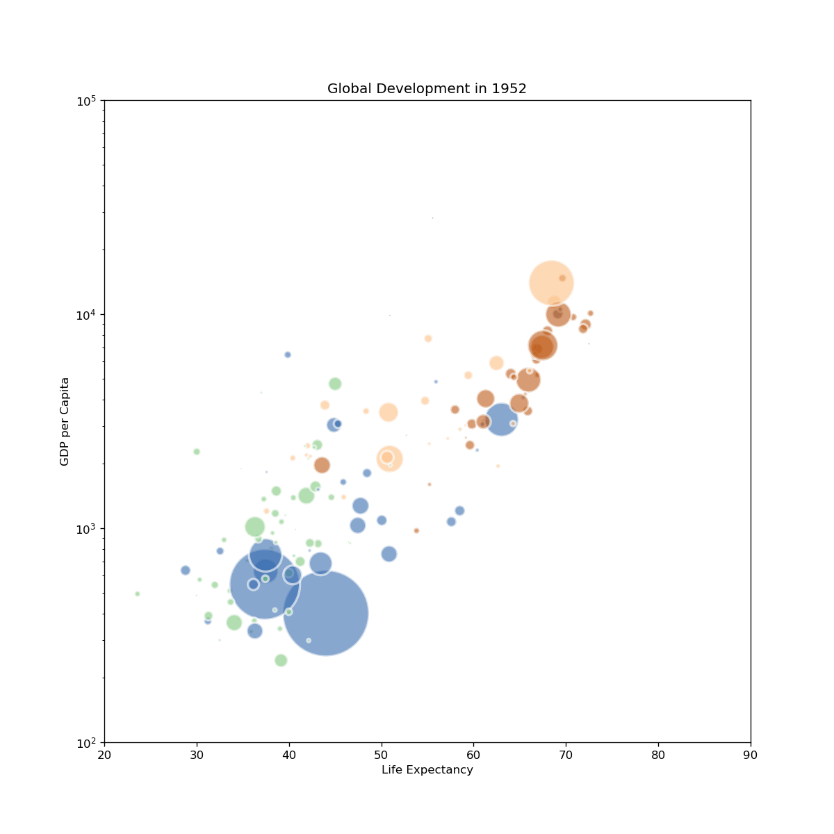
In [43]:
Copied!
fig, ax = plt.subplots(figsize=(10, 10), dpi=120)
def update(frame):
# Clear the current plot to redraw
ax.clear()
# Filter data for the specific year
yearly_data = interp_data.loc[interp_data.year == frame, :]
# Scatter plot for that year
ax.scatter(
x=yearly_data['lifeExp'],
y=yearly_data['gdpPercap'],
s=yearly_data['pop']/100000,
c=yearly_data['continent'].cat.codes,
cmap="Accent",
alpha=0.6,
edgecolors="white",
linewidths=2
)
# Updating titles and layout
ax.set_title(f"Global Development in {round(frame)}")
ax.set_xlabel("Life Expectancy")
ax.set_ylabel("GDP per Capita")
ax.set_yscale('log')
ax.set_ylim(100, 100000)
ax.set_xlim(20, 90)
return ax
ani = FuncAnimation(fig, update, frames=interp_data['year'].unique())
ani.save('output/gapminder-2.gif', fps=10)
plt.close(fig)
gapminder-2.gif: