Python Workshop - SENCE
Infos
Python
Python is an interpreted, high-level, general-purpose programming language. Created by Guido van Rossum and first released in 1991, Python's design philosophy emphasizes code readability with its notable use of significant whitespace. Its language constructs and object-oriented approach aim to help programmers write clear, logical code for small and large-scale projects.
How to install Python + Libraries
Download and install Anaconda (Python 3.12).
Check if Python has been installed
- Start-Menu
- "Anaconda Prompt" + Enter ↵
python+ Enter ↵print('Ja')+ Enter ↵exit()+ Enter ↵
Launch Jupyter Notebook
- Start-Menu
- "Jupyter Notebook" + Enter ↵
- Click on
New(top-right) - Choose
Python 3
Anaconda Navigator
Anaconda Navigator is a graphical user interface that is automatically installed with Anaconda. Navigator will open if the installation was successful.
Warning
This interface can also be really slow, and might crash. You don't actually need Anaconda Navigator to launch the listed programs, e.g. jupyter notebook or spyder.
- Windows: Click Start, search or select Anaconda Navigator from the menu.
- macOS: Click Launchpad, select Anaconda Navigator. Or, use Cmd+Space to open Spotlight Search and type “Navigator” to open the program.
- Linux: See next section.
Conda
If you prefer using a command line interface (CLI), you can use conda to verify the installation using Anaconda Prompt on Windows or terminal on Linux and macOS.
To open Anaconda Prompt:
- Windows: Click Start, search or select Anaconda Prompt from the menu.
- macOS: Cmd+Space to open Spotlight Search and type “Navigator” to open the program.
- Linux–CentOS: Open Applications - System Tools - terminal.
- Linux–Ubuntu: Open the Dash by clicking the upper left Ubuntu icon, then type “terminal”.
Links
Python Einführung
Zahlen (int & float)
7
0.001
1 + 1
2 * 3
7 / 2
4 / 2
7 // 2
7 % 2
2**3
11**137
Text (str)
"Hello Python"
len("Hello")
"hello".replace('e', 'a').capitalize()
"1,2;3,4;5,6".replace(',', '.')
Text & Zahlen
2 * 3
'2' * 3
'2*3'
int('2') * 3
float('3.5')
'2' + '3'
n = 9
f'file_{n}.txt'
ext = 'dat'
f'file_{n}.{ext}'
'a;b;c'.split(';')
Wertlisten (list)
['a', 'b', 'c']
len(['a', 'b', 'c'])
['a', 'b', 'c'][0]
['a', 'b', 'c'][:2]
['a', 'b', 'c'][2:]
['a', 'b', 'c'][::-1]
'abc'[1]
[1, 2, 3] + ['a', 'b', 'c']
';'.join(['a', 'b', 'c'])
range(5)
Boolesche Variable (True & False)
3 == 2
x = 5
y = 4
x > y
x >= x
x != y
12 > 7
'12' > '7'
'art' in 'Stuttgart'
6 in [5, 7, 2, 8, 4, 10, 1, 3, 9]
Mehr Wertlisten
values = [1, 2, 3, 4, 5, 6, 7, 8, 9, 10]
for value in values:
print(value)
[2**i for i in values]
[i for i in values if i > 5]
[i for i in values if i % 2 == 0]
Dateien
with open('SchPark01/SchPark_GT_2011_01_01.csv') as csv_file:
for line in csv_file:
print(line)
with open('new_file.txt', 'w') as new_file:
new_file.write("Hello\n")
Verzeichnisse
from pathlib import Path
for csv_path in Path('SchPark01').glob('*.csv'):
print(csv_path)
for csv_path in Path('SchPark03').glob('*/*/*.csv'):
print(csv_path)
Function
def f(a, b):
return a + b
f(2, 3)
Sortieren
sorted([3,1,2])
numbers = ['1', '2', '3', '4', '5', '6', '7', '8', '9', '10', '11', '12']
sorted(numbers)
sorted(numbers, key=int)
INSEL
Some examples are included in inselpy_examples
# pip install insel
import insel
insel.block('pi')
insel.block('sum', 2, 3)
insel.block('do', parameters=[1, 10, 1])
insel.template('a_times_b', a=7, b=3)
Übungen
Ziel
Ein Sensor hat vielen Dateien geliefert (365 pro Jahr). Es wäre schön, aus 365 Tagesdateien eine einzige Jahresdatei automatisch zu erzeugen.
Hier sind die Dateien : python_workshop_examples.zip
Die Skriptdateien sind schon da, sie haben aber nur eine Beschreibung und keinen Inhalt.
01_workshop_example.py
# Im SchPark01 :
# Eine Datei pro Tag
# Ohne Header
# Datum; Zeit; Horizontale Strahlung; Umgebungstemperatur
# YYYY/MM/DD;HH:MM;W/m2;Celsius
# 1 Verzeichnis pro Jahr
#
# -> 1 Datei fuers Jahr
02_workshop_example.py
# Im SchPark02 :
# Eine Datei pro Tag
# Mit Header
# Datum; Zeit; Horizontale Strahlung; Umgebungstemperatur
# YYYY/MM/DD;HH:MM;W/m2;Celsius
# 1 Verzeichnis pro Jahr
#
# -> 1 Datei fuers Jahr
03_workshop_example.py
# Im SchPark03 :
# Eine Datei pro Tag
# Mit Header
# Datum; Zeit; Horizontale Strahlung; Umgebungstemperatur
# YYYY/MM/DD;HH:MM;W/m2;Celsius
# 1 Verzeichnis pro Monat
#
# -> 1 Datei fuers Jahr
04_workshop_example.py
# Im SchPark04 :
# Eine Datei pro Tag
# Mit Header
# Datum, Zeit, Horizontale Strahlung, Umgebungstemperatur
# YYYY/MM/DD,HH:MM,W/m2,Celsius
# 1 Verzeichnis pro Monat
#
# -> 1 Datei fuers Jahr
05_workshop_example.py
# Im SchPark05 :
# Eine Datei pro Tag
# Mit Header
# Datum; Zeit; Horizontale Strahlung; Umgebungstemperatur
# YYYY/MM/DD;HH:MM;W/m2;Celsius
# 1 Verzeichnis pro Monat
#
# -> 1 Datei fuers Jahr (Excel .CSV)
06_workshop_example.py
# Im SchPark06 :
# Eine Datei pro Tag
# Mit Header
# Zeit; Horizontale Strahlung; Umgebungstemperatur
# HH:MM;W/m2;Celsius
# 1 Verzeichnis pro Monat
#
# -> 1 Datei fuers Jahr
07_workshop_example.py
# Im SchPark07 :
# Eine Datei pro Tag (Tag_Monat_Jahr.csv)
# Mit Header
# Zeit; Horizontale Strahlung; Umgebungstemperatur
# HH:MM;W/m2;Celsius
# 1 Verzeichnis pro Jahr
#
# -> 1 Datei fuers Jahr
08_workshop_example.py
# Im SchPark08 :
# Eine Datei pro Tag (Tag_Monat_Jahr.csv)
# Mit Header
# Zeit; Horizontale Strahlung; Umgebungstemperatur
# HH:MM;W/m2;Celsius
# 1 Verzeichnis fuer 2010 & 2011
#
# -> 1 Datei pro Jahr
Wichtige Libraries
Numpy
Array
import numpy as np
x = np.arange(10)
x + 1
(x + 1)**2
np.sin(x)
x > 3
2-D Arrays
table = np.arange(50).reshape(10,5)
table**2
Matrix
a = np.mat([[4, 3], [2, 1]])
b = np.mat([[1, 2], [3, 4]])
a * b
Matplotlib
Plot
import matplotlib.pyplot as plt
import numpy as np
t = np.linspace(0, 2*np.pi, 500)
plt.plot(t, np.sin(t))
plt.show()
Sankey
import matplotlib.pyplot as plt
from matplotlib.sankey import Sankey
s = Sankey()
s.add(flows=[0.7, 0.3, -0.5, -0.5],
labels=['a', 'b', 'c', 'd'],
orientations=[1, 1, -1, 0])
s.finish()
plt.show()
Pandas
import pandas as pd
df = pd.read_csv('SchPark01.csv',
sep=';',
header = None,
names = ['date', 'time', 'Gh', 'Ta'],
parse_dates = [[0, 1]],
skipinitialspace=True,
index_col = 0
)
df.Gh['2011-07-07 12:30']
df.Ta.mean()
df.plot()
Sympy
import sympy
from sympy.solvers import solve
x = sympy.Symbol('x')
solve(sympy.Eq(x**2, x + 1), x)
sympy.expand(x * (x + 1) * (x + 3))
Optimize
from scipy.optimize import minimize
def f(x):
return (x[0] + 2)**2 + (x[1] - 3)**2
minimize(f, [0, 0])
Uncertainties
# pip install uncertainties
from uncertainties import ufloat, umath
x = ufloat(39.5, 0.5)
x**2
umath.log(x)
y = x + 2
y
y - x
Many others
- pvlib (Photovoltaics)
- NetworkX (Graph theory)
- scikit-learn, TensorFlow and keras (machine learning)
- TensorFlow playground
- Stable Diffusion (Image generation from text)
- Kivy GUI apps for desktop & smartphones
- django or flask (Web services)
- BeautifulSoup (HTML/XML parser)
- PyGame (Video Games)
- missingno (Visualization of missing data)
- Python for ArcGIS, TRNSYS, DAYSIM, Blender, ...
Python for HfT
Lineare Gleichungssysteme Lösen
import numpy as np
a = np.array([[1,2], [3,2]])
b = np.array([19, 29])
# 1*x0 + 2*x1 = 19
# 3*x0 + 2*x1 = 29
x = np.linalg.solve(a, b)
np.dot(a, x)
np.allclose(np.dot(a,x),b)
Mit komplexen Zahlen rechnen
1 + 2j
complex(1, 2)
z = 1 + 2j
abs(z)
z.real
z.imag
z**3
import cmath
cmath.sin(z)
cmath.exp(z)
cmath.rect(1, cmath.pi/3)
Mehrdimensionale Matrizen
import numpy as np
m = np.arange(12)
m = m.reshape(2,3,2)
m[1]
m[1][2]
m[1][2][0]
m[:,2,:]
def f(i,j,k):
return (i + 3*j + 5*k)
np.fromfunction(f, (2,2,2))
Daten in 2D darstellen
import matplotlib.pyplot as plt
t = np.linspace(0, 2*np.pi, 500)
plt.plot(t, np.sin(t))
plt.show()
Daten in 3D darstellen
from mpl_toolkits.mplot3d import Axes3D # Needed for 3d plots
ax = plt.axes(projection='3d')
z = np.linspace(0, 1, 100)
x = z * np.sin(20 * z)
y = z * np.cos(20 * z)
ax.scatter(x, y, z, c = x+y)
plt.show()
Animationen (movies)
Tools → Preferences → Ipython Console → Graphics → Graphics Backend → Backend: “automatic”
import numpy as np
import matplotlib.pyplot as plt
import matplotlib.animation as animation
fig, ax = plt.subplots()
x = np.arange(0, 2*np.pi, 0.01)
line, = ax.plot(x, np.sin(x))
def animate(i):
line.set_ydata(np.sin(x + 2*i*np.pi/100.0) *np.cos(2*i*np.pi/200)) # update the data
return line,
def init():
line.set_ydata(np.ma.array(x, mask=True))
return line,
ani = animation.FuncAnimation(fig, animate, np.arange(1, 200), init_func=init,
interval=25, blit=True)
plt.show()
Fourier Transformation
import numpy as np
import matplotlib.pyplot as plt
N = 1000
T = 0.01
x = np.linspace(0.0, N*T, N)
y = np.where(abs(x)<=0.5, 1, 0) # Rectangular function
yf = np.fft.fft(y)
xf = np.linspace(0.0, 1.0/(2.0*T), N//2)
fig, ax = plt.subplots()
ax.plot(xf, 2.0/N * yf[:N//2])
plt.show()
Ab- und Aufleiten, Nullstellen
from sympy import *
init_printing() # for pretty printing
x,a = symbols('x a')
f = sin(sqrt((exp(x)+a)/2))
diff(f,x)
integrate(1/(1+x**2),x)
solve(f,x)
f.subs(x,log(-a))
Multi-plots
import numpy as np
import matplotlib.pyplot as plt
N = 5
x = np.linspace(0, 2 * np.pi, 400)
fig, subplots = plt.subplots(N, N, sharex='col', sharey='row')
for (i, j), subplot in np.ndenumerate(subplots):
subplot.plot(x, i * np.cos(x**2) + j * np.sin(x))
fig.suptitle("i * cos(x**2) + j * sin(x)")
plt.show()
Numpy
import numpy as np
x = np.arange(10)
x
array([0, 1, 2, 3, 4, 5, 6, 7, 8, 9])
x + 1
array([ 1, 2, 3, 4, 5, 6, 7, 8, 9, 10])
(x + 1)**2
array([ 1, 4, 9, 16, 25, 36, 49, 64, 81, 100])
np.sin(x)
array([ 0. , 0.84147098, 0.90929743, 0.14112001, -0.7568025 ,
-0.95892427, -0.2794155 , 0.6569866 , 0.98935825, 0.41211849])
np.sin(x).dtype
dtype('float64')
x > 3
array([False, False, False, False, True, True, True, True, True,
True])
x[:4]
array([0, 1, 2, 3])
x[7:]
array([7, 8, 9])
x[x > 3]
array([4, 5, 6, 7, 8, 9])
x[(x > 3) & (x < 7)]
array([4, 5, 6])
x[(x > 7) | (x < 3)]
array([0, 1, 2, 8, 9])
np.arange(50)
array([ 0, 1, 2, 3, 4, 5, 6, 7, 8, 9, 10, 11, 12, 13, 14, 15, 16,
17, 18, 19, 20, 21, 22, 23, 24, 25, 26, 27, 28, 29, 30, 31, 32, 33,
34, 35, 36, 37, 38, 39, 40, 41, 42, 43, 44, 45, 46, 47, 48, 49])
np.arange(50).reshape(10,5)
array([[ 0, 1, 2, 3, 4],
[ 5, 6, 7, 8, 9],
[10, 11, 12, 13, 14],
[15, 16, 17, 18, 19],
[20, 21, 22, 23, 24],
[25, 26, 27, 28, 29],
[30, 31, 32, 33, 34],
[35, 36, 37, 38, 39],
[40, 41, 42, 43, 44],
[45, 46, 47, 48, 49]])
table = _
table
array([[ 0, 1, 2, 3, 4],
[ 5, 6, 7, 8, 9],
[10, 11, 12, 13, 14],
[15, 16, 17, 18, 19],
[20, 21, 22, 23, 24],
[25, 26, 27, 28, 29],
[30, 31, 32, 33, 34],
[35, 36, 37, 38, 39],
[40, 41, 42, 43, 44],
[45, 46, 47, 48, 49]])
table**2
array([[ 0, 1, 4, 9, 16],
[ 25, 36, 49, 64, 81],
[ 100, 121, 144, 169, 196],
[ 225, 256, 289, 324, 361],
[ 400, 441, 484, 529, 576],
[ 625, 676, 729, 784, 841],
[ 900, 961, 1024, 1089, 1156],
[1225, 1296, 1369, 1444, 1521],
[1600, 1681, 1764, 1849, 1936],
[2025, 2116, 2209, 2304, 2401]])
(table**2)[2:4]
array([[100, 121, 144, 169, 196],
[225, 256, 289, 324, 361]])
(table**2)[:,2:4]
array([[ 4, 9],
[ 49, 64],
[ 144, 169],
[ 289, 324],
[ 484, 529],
[ 729, 784],
[1024, 1089],
[1369, 1444],
[1764, 1849],
[2209, 2304]])
(table**2)[5:7, 2:4]
array([[ 729, 784],
[1024, 1089]])
table ** 2 == 1089
array([[False, False, False, False, False],
[False, False, False, False, False],
[False, False, False, False, False],
[False, False, False, False, False],
[False, False, False, False, False],
[False, False, False, False, False],
[False, False, False, True, False],
[False, False, False, False, False],
[False, False, False, False, False],
[False, False, False, False, False]])
[index for (index, value) in np.ndenumerate(table**2) if value == 1089]
[(6, 3)]
l = list(range(10))
l
[0, 1, 2, 3, 4, 5, 6, 7, 8, 9]
[i * 2 for i in l if i < 5]
[0, 2, 4, 6, 8]
table**100
array([[ 0, 1, 0,
-2984622845537545263, 0],
[-3842938066129721103, 0, 3728452490685454945,
0, 6627890308811632801],
[ 0, -5485011738861510223, 0,
-8267457965844590319, 0],
[ 6813754833676406721, 0, -1895149777787118527,
0, 8207815121025376913],
[ 0, 1178643571979107377, 0,
5958518545374539809, 0],
[-7817535966050405663, 0, 4157753088978724465,
0, 3054346751387081297],
[ 0, 6365139678740040577, 0,
-8877898876394183551, 0],
[ 8170176069297290577, 0, -1901415581956121743,
0, 2024094702548431329],
[ 0, 6476859561917718817, 0,
5633018509028505393, 0],
[ 3548161959473065873, 0, -2387541571489615039,
0, 1459632558914132161]])
a = np.mat('4 3; 2 1')
b = np.mat('1 2; 3 4')
a**2
matrix([[22, 15],
[10, 7]])
a
matrix([[4, 3],
[2, 1]])
a*b
matrix([[13, 20],
[ 5, 8]])
(np.arange(4)+1).reshape(2,2)
array([[1, 2],
[3, 4]])
np.mat(_)
matrix([[1, 2],
[3, 4]])
import pandas as pd
Parse CSV, trial & error
pd.read_csv('output/SchPark01.csv')
| 2011/01/01;00:00;0.0;-0.6 | |
|---|---|
| 0 | 2011/01/01;00:15;0.0;-0.4 |
| 1 | 2011/01/01;00:30;0.0;-0.5 |
| 2 | 2011/01/01;00:45;0.0;-0.5 |
| 3 | 2011/01/01;01:00;0.0;-0.7 |
| 4 | 2011/01/01;01:15;0.0;-0.6 |
| ... | ... |
| 35034 | 2011/12/31;22:45;0.0;7.9 |
| 35035 | 2011/12/31;23:00;0.0;7.9 |
| 35036 | 2011/12/31;23:15;0.0;8.4 |
| 35037 | 2011/12/31;23:30;0.0;8.5 |
| 35038 | 2011/12/31;23:45;0.0;8.1 |
35039 rows × 1 columns
pd.read_csv('output/SchPark01.csv', sep=';')
| 2011/01/01 | 00:00 | 0.0 | -0.6 | |
|---|---|---|---|---|
| 0 | 2011/01/01 | 00:15 | 0.0 | -0.4 |
| 1 | 2011/01/01 | 00:30 | 0.0 | -0.5 |
| 2 | 2011/01/01 | 00:45 | 0.0 | -0.5 |
| 3 | 2011/01/01 | 01:00 | 0.0 | -0.7 |
| 4 | 2011/01/01 | 01:15 | 0.0 | -0.6 |
| ... | ... | ... | ... | ... |
| 35034 | 2011/12/31 | 22:45 | 0.0 | 7.9 |
| 35035 | 2011/12/31 | 23:00 | 0.0 | 7.9 |
| 35036 | 2011/12/31 | 23:15 | 0.0 | 8.4 |
| 35037 | 2011/12/31 | 23:30 | 0.0 | 8.5 |
| 35038 | 2011/12/31 | 23:45 | 0.0 | 8.1 |
35039 rows × 4 columns
pd.read_csv('output/SchPark01.csv', sep=';',
names = ['date', 'time', 'ghi', 'ta'])
| date | time | ghi | ta | |
|---|---|---|---|---|
| 0 | 2011/01/01 | 00:00 | 0.0 | -0.6 |
| 1 | 2011/01/01 | 00:15 | 0.0 | -0.4 |
| 2 | 2011/01/01 | 00:30 | 0.0 | -0.5 |
| 3 | 2011/01/01 | 00:45 | 0.0 | -0.5 |
| 4 | 2011/01/01 | 01:00 | 0.0 | -0.7 |
| ... | ... | ... | ... | ... |
| 35035 | 2011/12/31 | 22:45 | 0.0 | 7.9 |
| 35036 | 2011/12/31 | 23:00 | 0.0 | 7.9 |
| 35037 | 2011/12/31 | 23:15 | 0.0 | 8.4 |
| 35038 | 2011/12/31 | 23:30 | 0.0 | 8.5 |
| 35039 | 2011/12/31 | 23:45 | 0.0 | 8.1 |
35040 rows × 4 columns
Parse CSV
df = pd.read_csv('output/SchPark01.csv',
sep = ';',
na_values = ' ',
names = ['date', 'time', 'ghi', 'ta'],
)
# https://stackoverflow.com/a/77983644/6419007
df['datetime'] = pd.to_datetime(df.pop('date')+' '+ df.pop('time'),
format="%Y/%m/%d %H:%M")
df = df.set_index('datetime')
df
| ghi | ta | |
|---|---|---|
| datetime | ||
| 2011-01-01 00:00:00 | 0.0 | -0.6 |
| 2011-01-01 00:15:00 | 0.0 | -0.4 |
| 2011-01-01 00:30:00 | 0.0 | -0.5 |
| 2011-01-01 00:45:00 | 0.0 | -0.5 |
| 2011-01-01 01:00:00 | 0.0 | -0.7 |
| ... | ... | ... |
| 2011-12-31 22:45:00 | 0.0 | 7.9 |
| 2011-12-31 23:00:00 | 0.0 | 7.9 |
| 2011-12-31 23:15:00 | 0.0 | 8.4 |
| 2011-12-31 23:30:00 | 0.0 | 8.5 |
| 2011-12-31 23:45:00 | 0.0 | 8.1 |
35040 rows × 2 columns
Plots
import matplotlib.pyplot as plt
plt.rcParams['figure.figsize'] = (15, 8)
df.plot();

df.resample('ME').mean().plot();

import seaborn as sns
sns.heatmap(
pd.pivot_table(df, values='ghi', index=df.index.time, columns=df.index.dayofyear),
annot=False);

sns.heatmap(
pd.pivot_table(df, values='ta', index=df.index.time, columns=df.index.dayofyear),
annot=False);

# https://stackoverflow.com/a/16345735/6419007
# NOTE: it used to be x.time, now it's apparently x.time()
df2 = df.groupby(lambda x: x.time()).ffill()
df2
| ghi | ta | |
|---|---|---|
| datetime | ||
| 2011-01-01 00:00:00 | 0.0 | -0.6 |
| 2011-01-01 00:15:00 | 0.0 | -0.4 |
| 2011-01-01 00:30:00 | 0.0 | -0.5 |
| 2011-01-01 00:45:00 | 0.0 | -0.5 |
| 2011-01-01 01:00:00 | 0.0 | -0.7 |
| ... | ... | ... |
| 2011-12-31 22:45:00 | 0.0 | 7.9 |
| 2011-12-31 23:00:00 | 0.0 | 7.9 |
| 2011-12-31 23:15:00 | 0.0 | 8.4 |
| 2011-12-31 23:30:00 | 0.0 | 8.5 |
| 2011-12-31 23:45:00 | 0.0 | 8.1 |
35040 rows × 2 columns
sns.heatmap(
pd.pivot_table(df2, values='ghi', index=df2.index.time, columns=df2.index.dayofyear),
annot=False);

sns.heatmap(
pd.pivot_table(df2, values='ta', index=df2.index.time, columns=df2.index.dayofyear),
annot=False);

Title, labels, units
import matplotlib.dates as mdates
month_locator = mdates.MonthLocator(bymonthday=15)
ax = sns.heatmap(
pd.pivot_table(df2, values='ta', index=df2.index.map(lambda x: x.strftime("%H:%M")),
columns=df2.index.dayofyear),
annot=False,
cbar_kws={'label': '', 'format': '%.0f °C'}
)
plt.title("Temperature in SchPark")
plt.xlabel("")
plt.ylabel("")
ax.xaxis.set_major_locator(month_locator)
ax.xaxis.set_major_formatter(mdates.DateFormatter("%B"))
plt.show()

df.ta.mean()
12.796018797659162
df2.ta.mean()
12.749155251141554
df.sort_values('ghi', ascending=False).ghi.plot(use_index=False, title='Sorted irradiance');

df.sort_values('ta', ascending=False).ta.plot(use_index=False, title = 'Sorted temperature');

df.plot(x='ghi', y='ta', xlabel='GHI [W/m²]', ylabel='Temperature', kind='scatter');

Warmest day
max_temp = df2.ta.max()
max_temp
38.3
warmest_date = df2[df2.ta == df2.ta.max()].index.date[0]
warmest_date
datetime.date(2011, 8, 23)
warmest_day = df2[df2.index.date == warmest_date]
warmest_day
| ghi | ta | |
|---|---|---|
| datetime | ||
| 2011-08-23 00:00:00 | 0.0 | 27.9 |
| 2011-08-23 00:15:00 | 0.0 | 27.7 |
| 2011-08-23 00:30:00 | 0.0 | 27.1 |
| 2011-08-23 00:45:00 | 0.0 | 26.7 |
| 2011-08-23 01:00:00 | 0.0 | 27.0 |
| ... | ... | ... |
| 2011-08-23 22:45:00 | 0.0 | 28.2 |
| 2011-08-23 23:00:00 | 0.0 | 28.1 |
| 2011-08-23 23:15:00 | 0.0 | 28.0 |
| 2011-08-23 23:30:00 | 0.0 | 28.3 |
| 2011-08-23 23:45:00 | 0.0 | 28.4 |
96 rows × 2 columns
warmest_day.ghi.plot(title='Irradiance during warmest day in SchPark, 2011');

warmest_day.ta.plot(title='Temperature during warmest day in SchPark, 2011');

Montly temperature ridge lines
df2.ta[df2.index.month==7].plot.hist(bins=50, title='Temperature distribution in July [°C]');

# getting necessary libraries
import numpy as np
import pandas as pd
import seaborn as sns
import matplotlib.pyplot as plt
def ridge_lines(weather, column_name, title, xaxis):
df = weather.copy()
sns.set_theme(style="white", rc={"axes.facecolor": (0, 0, 0, 0)})
# we define a dictionary with months that we'll use later
month_dict = {1: 'january',
2: 'february',
3: 'march',
4: 'april',
5: 'may',
6: 'june',
7: 'july',
8: 'august',
9: 'september',
10: 'october',
11: 'november',
12: 'december'}
df['month'] = df.index.month.map(month_dict)
month_mean_serie = df.groupby('month')[column_name].mean()
df['mean_month'] = df['month'].map(month_mean_serie)
# we generate a color palette with Seaborn.color_palette()
pal = sns.color_palette(palette='coolwarm', n_colors=12)
# in the sns.FacetGrid class, the 'hue' argument is the one that is the one that will be represented by colors with 'palette'
g = sns.FacetGrid(df, row='month', hue='mean_month', aspect=15, height=0.75, palette=pal)
# then we add the densities kdeplots for each month
g.map(sns.kdeplot, column_name,
bw_adjust=1, clip_on=False,
fill=True, alpha=1, linewidth=1.5)
# here we add a white line that represents the contour of each kdeplot
g.map(sns.kdeplot, column_name,
bw_adjust=1, clip_on=False,
color="w", lw=2)
# here we add a horizontal line for each plot
g.map(plt.axhline, y=0,
lw=2, clip_on=False)
# we loop over the FacetGrid figure axes (g.axes.flat) and add the month as text with the right color
# notice how ax.lines[-1].get_color() enables you to access the last line's color in each matplotlib.Axes
for i, ax in enumerate(g.axes.flat):
ax.text(-15, 0.02, month_dict[i+1],
fontweight='bold', fontsize=15,
color=ax.lines[-1].get_color())
# we use matplotlib.Figure.subplots_adjust() function to get the subplots to overlap
g.fig.subplots_adjust(hspace=-0.3)
# eventually we remove axes titles, yticks and spines
g.set_titles("")
g.set_ylabels("")
g.set(yticks=[])
g.despine(bottom=True, left=True)
plt.setp(ax.get_xticklabels(), fontsize=15, fontweight='bold')
plt.xlabel(xaxis, fontweight='bold', fontsize=15)
g.fig.suptitle(title,
ha='right',
fontsize=20,
fontweight=20)
plt.show()
ridge_lines(df, 'ta', 'Temperature distribution in Scharnhauser Park (2011)', 'Temperature in degree Celsius')

pvlib tutorial
Install with conda install -c pvlib pvlib
This page contains introductory examples of pvlib python usage. It is based on the Object Oriented code from https://pvlib-python.readthedocs.io/en/stable/introtutorial.html
The goal is to simulate a small PV system in different locations, and try to predict how much energy it could produce.
The code should be as concise as possible, while still delivering plausible results and taking weather into account.
Uploaded to https://gist.github.com/EricDuminil/f646d406967fe965190d2d3fa58df618 Pinged to https://stackoverflow.com/questions/57682450/importing-non-tmy3-format-weather-data-for-use-in-pvlib-simulation/57826625#57826625
Module import
from pvlib.pvsystem import PVSystem, retrieve_sam
from pvlib.location import Location
from pvlib.modelchain import ModelChain
from pvlib.temperature import TEMPERATURE_MODEL_PARAMETERS
from pvlib.iotools import pvgis
# Not required, but recommended.
# It avoids downloading same data over and over again from PVGIS.
# https://pypi.org/project/requests-cache/
# pip install requests-cache
import requests_cache
requests_cache.install_cache('pvgis_requests_cache', backend='sqlite')
Locations, Module & Inverter
# latitude, longitude, name , altitude, timezone
coordinates = [( 32.2 , -111.0, 'Tucson, Arizona' , 700, 'Etc/GMT+7'),
( 35.1 , -106.6, 'Albuquerque, New Mexico' , 1500, 'Etc/GMT+7'),
( 37.8 , -122.4, 'San Francisco, California', 10, 'Etc/GMT+8'),
( 52.5 , 13.4, 'Berlin, Germany' , 34, 'Etc/GMT-1'),
(-20.9 , 55.5, 'St-Denis, La Réunion' , 100, 'Etc/GMT-4')]
# Get the module and inverter specifications from SAM (https://github.com/NREL/SAM)
module = retrieve_sam('SandiaMod')['Canadian_Solar_CS5P_220M___2009_']
inverter = retrieve_sam('cecinverter')['ABB__MICRO_0_25_I_OUTD_US_208__208V_']
temp_parameters = TEMPERATURE_MODEL_PARAMETERS['sapm']['open_rack_glass_glass']
Simulation
for latitude, longitude, name, altitude, timezone in coordinates:
location = Location(latitude, longitude, name=name,
altitude=altitude, tz=timezone)
# Download weather data from PVGIS server
weather, _, info, _ = pvgis.get_pvgis_tmy(location.latitude,
location.longitude)
# Rename columns from PVGIS TMY in order to define the required data.
weather = weather.rename(columns={'G(h)': 'ghi',
'Gb(n)': 'dni',
'Gd(h)': 'dhi',
'T2m': 'temp_air'
})
# Same logic as orientation_strategy='south_at_latitude_tilt', but might be
# a bit clearer for locations in southern hemishpere.
system = PVSystem(module_parameters=module,
inverter_parameters=inverter,
temperature_model_parameters=temp_parameters,
surface_tilt=abs(latitude),
surface_azimuth=180 if latitude > 0 else 0)
mc = ModelChain(system, location)
mc.run_model(weather)
mount = system.arrays[0].mount
# Reporting
nominal_power = module.Impo * module.Vmpo
annual_energy = mc.results.ac.sum()
specific_yield = annual_energy / nominal_power
global_poa = mc.results.total_irrad.poa_global.sum() / 1000
average_ambient_temperature = weather.temp_air.mean()
performance_ratio = specific_yield / global_poa
weather_source = '%s (%d - %d)' % (info['meteo_data']['radiation_db'],
info['meteo_data']['year_min'],
info['meteo_data']['year_max'])
latitude_NS = '%.1f°%s' % (abs(latitude), 'N' if latitude > 0 else 'S')
longitude_EW = '%.1f°%s' % (abs(longitude), 'E' if longitude > 0 else 'W')
print('## %s (%s %s, %s)' % (name, latitude_NS, longitude_EW, timezone))
print('Nominal power : %.2f kWp' % (nominal_power / 1000))
print('Surface azimuth : %.0f °' % mount.surface_azimuth)
print('Surface tilt : %.0f °' % mount.surface_tilt)
print('Weather data source : %s' % weather_source)
print('Global POA irradiance : %.0f kWh / (m² · y)' % global_poa)
print('Average temperature : %.1f °C' % average_ambient_temperature)
print('Total yield : %.0f kWh / y' % (annual_energy / 1000))
print('Specific yield : %.0f kWh / (kWp · y)' % specific_yield)
print('Performance ratio : %.1f %%' % (performance_ratio * 100))
print()
/home/ricou/anaconda3/lib/python3.9/site-packages/pvlib/iotools/pvgis.py:477: pvlibDeprecationWarning: PVGIS variable names will be renamed to pvlib conventions by default starting in pvlib 0.10.0. Specify map_variables=True to enable that behavior now, or specify map_variables=False to hide this warning. warnings.warn(
## Tucson, Arizona (32.2°N 111.0°W, Etc/GMT+7) Nominal power : 0.22 kWp Surface azimuth : 180 ° Surface tilt : 32 ° Weather data source : PVGIS-NSRDB (2005 - 2015) Global POA irradiance : 2405 kWh / (m² · y) Average temperature : 21.4 °C Total yield : 425 kWh / y Specific yield : 1936 kWh / (kWp · y) Performance ratio : 80.5 % ## Albuquerque, New Mexico (35.1°N 106.6°W, Etc/GMT+7) Nominal power : 0.22 kWp Surface azimuth : 180 ° Surface tilt : 35 ° Weather data source : PVGIS-NSRDB (2005 - 2015) Global POA irradiance : 2390 kWh / (m² · y) Average temperature : 14.5 °C Total yield : 439 kWh / y Specific yield : 2001 kWh / (kWp · y) Performance ratio : 83.7 % ## San Francisco, California (37.8°N 122.4°W, Etc/GMT+8) Nominal power : 0.22 kWp Surface azimuth : 180 ° Surface tilt : 38 ° Weather data source : PVGIS-NSRDB (2005 - 2015) Global POA irradiance : 2009 kWh / (m² · y) Average temperature : 12.8 °C Total yield : 383 kWh / y Specific yield : 1746 kWh / (kWp · y) Performance ratio : 86.9 % ## Berlin, Germany (52.5°N 13.4°E, Etc/GMT-1) Nominal power : 0.22 kWp Surface azimuth : 180 ° Surface tilt : 52 ° Weather data source : PVGIS-SARAH (2005 - 2016) Global POA irradiance : 1254 kWh / (m² · y) Average temperature : 10.4 °C Total yield : 239 kWh / y Specific yield : 1088 kWh / (kWp · y) Performance ratio : 86.7 % ## St-Denis, La Réunion (20.9°S 55.5°E, Etc/GMT-4) Nominal power : 0.22 kWp Surface azimuth : 0 ° Surface tilt : 21 ° Weather data source : PVGIS-SARAH (2005 - 2016) Global POA irradiance : 2141 kWh / (m² · y) Average temperature : 18.1 °C Total yield : 396 kWh / y Specific yield : 1802 kWh / (kWp · y) Performance ratio : 84.2 %
Detailed pvlib report
LATITUDE = 48.77
LONGITUDE = 9.18
LOCATION = 'Stuttgart'
TIMEZONE = 'Etc/GMT-1'
ALTITUDE = 400
ALBEDO = 0.2 # Standard is 0.25. Why?
# -20.9 , 55.5, 'St-Denis, La Réunion' , 100, 'Etc/GMT-4')
AZIMUTH = 180
TILT = 25
#TODO: Get timezone automatically
#TODO: Add requirements.txt
#TODO: Define functions each time, with only the strictly required parameters
Enable caching
pip install requests-cache
# Not required. Avoids downloading same data over and over again:
import requests_cache
requests_cache.install_cache('pvgis_requests_cache', backend='sqlite')
Get weather
pip install pvlib
from pvlib.iotools import pvgis
weather, _, info, _ = pvgis.get_pvgis_tmy(LATITUDE, LONGITUDE, map_variables=True)
weather_source = '%s (%d - %d)' % (info['meteo_data']['radiation_db'],
info['meteo_data']['year_min'],
info['meteo_data']['year_max'])
latitude_NS = '%.1f°%s' % (abs(LATITUDE), 'N' if LATITUDE > 0 else 'S')
longitude_EW = '%.1f°%s' % (abs(LONGITUDE), 'E' if LONGITUDE > 0 else 'W')
# Rename columns from PVGIS TMY in order to define the required data.
weather = weather.rename(columns={'G(h)': 'ghi',
'Gb(n)': 'dni',
'Gd(h)': 'dhi',
'T2m': 'temp_air',
'WS10m': 'wind_speed' # Does it make sense to use wind speed from 10m height?
})
weather
| temp_air | relative_humidity | ghi | dni | dhi | IR(h) | wind_speed | wind_direction | pressure | |
|---|---|---|---|---|---|---|---|---|---|
| time(UTC) | |||||||||
| 2016-01-01 00:00:00+00:00 | 2.70 | 96.70 | 0.0 | 0.0 | 0.0 | 292.75 | 1.06 | 219.0 | 99358.0 |
| 2016-01-01 01:00:00+00:00 | 3.26 | 97.01 | 0.0 | 0.0 | 0.0 | 299.49 | 1.05 | 228.0 | 99374.0 |
| 2016-01-01 02:00:00+00:00 | 3.83 | 97.32 | 0.0 | 0.0 | 0.0 | 306.23 | 1.03 | 238.0 | 99390.0 |
| 2016-01-01 03:00:00+00:00 | 4.39 | 97.62 | 0.0 | 0.0 | 0.0 | 312.97 | 1.01 | 222.0 | 99383.0 |
| 2016-01-01 04:00:00+00:00 | 4.96 | 97.93 | 0.0 | 0.0 | 0.0 | 319.71 | 0.99 | 207.0 | 99377.0 |
| ... | ... | ... | ... | ... | ... | ... | ... | ... | ... |
| 2007-12-31 19:00:00+00:00 | -0.12 | 95.16 | 0.0 | 0.0 | 0.0 | 259.05 | 1.16 | 248.0 | 99586.0 |
| 2007-12-31 20:00:00+00:00 | 0.45 | 95.47 | 0.0 | 0.0 | 0.0 | 265.79 | 1.14 | 246.0 | 99574.0 |
| 2007-12-31 21:00:00+00:00 | 1.01 | 95.78 | 0.0 | 0.0 | 0.0 | 272.53 | 1.12 | 248.0 | 99561.0 |
| 2007-12-31 22:00:00+00:00 | 1.57 | 96.09 | 0.0 | 0.0 | 0.0 | 279.27 | 1.10 | 249.0 | 99548.0 |
| 2007-12-31 23:00:00+00:00 | 2.14 | 96.39 | 0.0 | 0.0 | 0.0 | 286.01 | 1.08 | 251.0 | 99535.0 |
8760 rows × 9 columns
# Force all dates to be from the same year
COERCE_YEAR = 2019
weather.index = weather.index.map(lambda dt: dt.replace(year=COERCE_YEAR))
Check and display weather
import matplotlib.pyplot as plt
import matplotlib.ticker as mticker
plt.rcParams['figure.figsize'] = [15, 10]
Ambient temperature
weather.temp_air.plot(title='Ambient temperature in %s\n%s' % (LOCATION, weather_source), color='#603a47')
plt.gca().yaxis.set_major_formatter(mticker.FormatStrFormatter('%d °C'))

print("Average temperature in %s : %.1f °C" % (LOCATION, weather.temp_air.mean()))
daily_temperatures = weather.temp_air.resample('D').mean()
print("Coldest day in %s : %.1f °C" % (LOCATION, daily_temperatures.min()))
print("Warmest day in %s : %.1f °C" % (LOCATION, daily_temperatures.max()))
Average temperature in Stuttgart : 11.7 °C Coldest day in Stuttgart : -6.7 °C Warmest day in Stuttgart : 26.8 °C
plt.figure(figsize=(15, 8))
plt.imshow(weather.temp_air.values.reshape(-1,24).T,
aspect='auto',
origin='lower', cmap='inferno')
plt.title('Ambient temperature in %s\n%s' % (LOCATION, weather_source))
plt.xlabel('Day of the year')
plt.ylabel('Hour')
plt.gca().yaxis.set_major_formatter(mticker.FormatStrFormatter('%d h'))
plt.colorbar();

Define system
from pvlib.pvsystem import PVSystem, retrieve_sam
from pvlib.location import Location
from pvlib.modelchain import ModelChain
from pvlib.temperature import TEMPERATURE_MODEL_PARAMETERS
# Get the module and inverter specifications from SAM
module = retrieve_sam('SandiaMod')['Canadian_Solar_CS5P_220M___2009_']
inverter = retrieve_sam('cecinverter')['ABB__MICRO_0_25_I_OUTD_US_208__208V_']
temp_parameters = TEMPERATURE_MODEL_PARAMETERS['sapm']['open_rack_glass_glass']
location = Location(LATITUDE, LONGITUDE, name=LOCATION,
altitude=ALTITUDE, tz=TIMEZONE)
system = PVSystem(module_parameters=module,
inverter_parameters=inverter,
temperature_model_parameters=temp_parameters,
surface_tilt=TILT,
surface_azimuth=AZIMUTH,
albedo = ALBEDO
)
mc = ModelChain(system, location, transposition_model='haydavies')
results = mc.run_model(weather)
Global horizontal irradiance
irradiances = weather.ghi.resample('M').mean().to_frame()
irradiances['poa'] = mc.results.total_irrad.poa_global.resample('M').mean()
irradiances.index = irradiances.index.month_name()
plt.figure(figsize=(15, 8))
plt.imshow(weather.ghi.values.reshape(-1,24).T,
aspect='auto',
origin='lower')
plt.title('Global Horizontal Irradiance in %s\n%s'% (LOCATION, weather_source))
plt.xlabel('Day of the year')
plt.ylabel('Hour')
plt.gca().yaxis.set_major_formatter(mticker.FormatStrFormatter('%d h'))
plt.colorbar();

Solar position
# Adapted from https://pvlib-python.readthedocs.io/en/stable/auto_examples/plot_sunpath_diagrams.html#polar-plot
from pvlib import solarposition
import pandas as pd
import numpy as np
solpos = mc.results.solar_position
# remove nighttime
solpos = solpos.loc[solpos['apparent_elevation'] > 0, :]
ax = plt.subplot(1, 1, 1, projection='polar')
# draw the analemma loops
points = ax.scatter(np.radians(solpos.azimuth), solpos.apparent_zenith,
s=2, label=None, c=solpos.index.dayofyear)
ax.figure.colorbar(points)
# draw hour labels
for hour in np.unique(solpos.index.hour):
# choose label position by the smallest radius for each hour
subset = solpos.loc[solpos.index.hour == hour, :]
r = subset.apparent_zenith
pos = solpos.loc[r.idxmin(), :]
ax.text(np.radians(pos['azimuth']), pos['apparent_zenith'], str(hour))
# draw individual days
for day_of_year in [80, 172, 355]: # should correspond to March 21st, June 21st and December 21st:
solpos = mc.results.solar_position[mc.results.solar_position.index.dayofyear == day_of_year]
solpos = solpos.loc[solpos['apparent_elevation'] > -20, :]
label = solpos.index[0].strftime('%Y-%m-%d')
ax.plot(np.radians(solpos.azimuth), solpos.apparent_zenith, label=label)
ax.figure.legend(loc='upper left')
# change coordinates to be like a compass
ax.set_theta_zero_location('N')
ax.set_theta_direction(-1)
ax.set_rmax(90)
plt.title("Sun position in %s" % LOCATION)
plt.show()

Optimum tilt for given azimuth and location
tilts = range(91)
insolation_for_tilts = []
mount = system.arrays[0].mount
for tilt in tilts:
#NOTE: Running a whole PV simulation just for POA irradiance isn't optimal. It requires fewer parameters, though.
mount.surface_tilt = tilt
mc.run_model(weather)
print('.', end='')
insolation_for_tilts.append(mc.results.total_irrad.poa_global.sum() / 1000)
# Reset mc back to defined tilt
mount.surface_tilt = TILT
mc.run_model(weather);
...........................................................................................
highest_insolation=max(insolation_for_tilts)
best_tilt = tilts[np.argmax(insolation_for_tilts)]
plt.plot(tilts, insolation_for_tilts, color='black')
plt.ylim(ymin=0, ymax=highest_insolation+100)
plt.xlim(xmin=0, xmax=90)
plt.xlabel('Tilt')
plt.ylabel('Global insolation')
plt.title("Yearly insolation on a tilted plane in %s\nAzimuth : %.0f°\n%s" % (LOCATION, AZIMUTH, weather_source))
plt.gca().xaxis.set_major_formatter(mticker.FormatStrFormatter('%d °'))
plt.gca().yaxis.set_major_formatter(mticker.FormatStrFormatter('%d kWh/(m².y)'))
plt.annotate('Highest insolation, at %.0f°\n%.0f kWh/(m².y)' % (best_tilt, highest_insolation),
xy=(best_tilt, highest_insolation),
xytext=(best_tilt, highest_insolation-200),
arrowprops=dict(facecolor='orange', shrink=0.05)
)
plt.show()

Plane of array irradiance
ax=irradiances.plot.bar(title='Monthly average irradiances in %s\nAzimuth: %.0f° Tilt: %.0f°\n%s' % (LOCATION, AZIMUTH, TILT, weather_source),
color=['black', '#f47b20'],
alpha=0.6);
ax.yaxis.set_major_formatter(mticker.FormatStrFormatter('%d W/m²'))

print("Average GHI irradiance in %s : %.1f W/m²" % (LOCATION, weather.ghi.mean()))
daily_temperatures = weather.temp_air.resample('D').mean()
print("Average POA irradiance in %s : %.1f W/m²" % (LOCATION, mc.results.total_irrad.poa_global.mean()))
print("Total GHI insolation in %s : %.0f kWh/(m² . y)" % (LOCATION, weather.ghi.sum() / 1000))
print("Total POA insolation in %s : %.0f kWh/(m² . y)" % (LOCATION, mc.results.total_irrad.poa_global.sum() / 1000))
Average GHI irradiance in Stuttgart : 133.0 W/m² Average POA irradiance in Stuttgart : 153.9 W/m² Total GHI insolation in Stuttgart : 1165 kWh/(m² . y) Total POA insolation in Stuttgart : 1348 kWh/(m² . y)
# That's weird. POA seems too high!
# Perez is even worse than HayDavies
# Standard albedo is 0.25
print(system.arrays[0].albedo)
0.2
plt.figure(figsize=(15, 8))
plt.imshow(mc.results.total_irrad.poa_global.values.reshape(-1,24).T,
aspect='auto',
origin='lower')
plt.title('POA global irradiance in %s\nAzimuth: %.0f° Tilt: %.0f°\n%s' %
(LOCATION, AZIMUTH, TILT, weather_source))
plt.xlabel('Day of the year')
plt.ylabel('Hour')
plt.gca().yaxis.set_major_formatter(mticker.FormatStrFormatter('%d h'))
plt.colorbar();

Albedo + Diffuse + Direct
#TODO: DRY with december
ax = weather[weather.index.isocalendar().week == 26].ghi.plot(style='--', color='#555555', legend='GHI')
mc.results.total_irrad[mc.results.total_irrad.index.isocalendar().week == 26].plot.area(
ax=ax,
title='POA irradiances around June solstice in %s\nAzimuth: %.0f° Tilt: %.0f°\n%s' %
(LOCATION, AZIMUTH, TILT, weather_source),
y=['poa_ground_diffuse', 'poa_sky_diffuse', 'poa_direct'],
color=["#22cb22", "#89cbdf", "#f47b20"],
lw=0
)
ax.yaxis.set_major_formatter(mticker.FormatStrFormatter('%d W/m²'))

ax = weather[weather.index.isocalendar().week == 50].ghi.plot(style='--', color='#555555', legend='GHI')
mc.results.total_irrad[mc.results.total_irrad.index.isocalendar().week == 50].plot.area(
ax=ax,
title='POA irradiances around December solstice in %s\nAzimuth: %.0f° Tilt: %.0f°\n%s' %
(LOCATION, AZIMUTH, TILT, weather_source),
y=['poa_ground_diffuse', 'poa_sky_diffuse', 'poa_direct'],
color=["#22cb22", "#89cbdf", "#f47b20"],
lw=0
)
ax.yaxis.set_major_formatter(mticker.FormatStrFormatter('%d W/m²'))

Misc
i = mc.results.total_irrad
all(np.isclose(i.poa_diffuse, i.poa_sky_diffuse + i.poa_ground_diffuse))
True
all(np.isclose(i.poa_global, i.poa_direct + i.poa_sky_diffuse + i.poa_ground_diffuse))
True
mc.dc_model()
ModelChain: name: None clearsky_model: ineichen transposition_model: haydavies solar_position_method: nrel_numpy airmass_model: kastenyoung1989 dc_model: sapm ac_model: sandia_inverter aoi_model: sapm_aoi_loss spectral_model: sapm_spectral_loss temperature_model: sapm_temp losses_model: no_extra_losses
#TODO: Add I(V), P(V)
#TODO: Add eta inverter curve
#TODO: Check what's missing from insel report
Fourier
import numpy as np
import matplotlib.pyplot as plt
N = 1000
T = 0.01
x = np.linspace(0.0, N*T, N)
y = np.where(abs(x)<=0.5, 1, 0) # Rectangular function
plt.plot(x, y);

yf = np.fft.fft(y)
xf = np.linspace(0.0, 1.0/(2.0*T), N//2)
plt.plot(xf, 2.0/N * yf[:N//2].real);

Write XLSX
# You could read a real CSV file instead
csv_lines = ['a;b;c;d\n', '1;2;3;4\n', '5;6;7;8\n']
import xlsxwriter
workbook = xlsxwriter.Workbook('filename.xlsx')
worksheet = workbook.add_worksheet()
i = 0 # line number
for line in csv_lines:
date, time, gh, ta = line.replace('\n', '').split(';')
worksheet.write(i, 0, date)
worksheet.write(i, 1, time)
worksheet.write(i, 2, gh)
worksheet.write(i, 3, ta)
i += 1
workbook.close()
Read XLSX
import pandas as pd
pd.read_excel('filename.xlsx')
| a | b | c | d | |
|---|---|---|---|---|
| 0 | 1 | 2 | 3 | 4 |
| 1 | 5 | 6 | 7 | 8 |
Remove file
BE VERY CAREFUL!
import os
os.remove('filename.xlsx')
SENCE 2021 Examples
Many examples are copied from https://www.python-graph-gallery.com/
Sankey (with plotly)
basic example
import plotly.graph_objects as go
from IPython.display import Image
Image(filename='images/graph2.jpg')
# Graph with nodes, flows, and weights:

source = [0, 2, 2, 1, 3, 3]
target = [2, 1, 3, 4, 4, 3]
value = [50, 30, 20, 30, 10, 10]
link = dict(source = source, target = target, value = value)
data = go.Sankey(link = link, node = dict(label= ["A", "B", "C", "D", "E"]))
fig = go.Figure(data)
fig.write_html("simple-sankey.html")
# Alternative : fig.show()
%%html
<iframe src="/simple-sankey.html" width="800" height="600"
title="Sankey with plotly" style="border:none"></iframe>
More complex example
import plotly.graph_objects as go
import urllib, json
url = 'https://raw.githubusercontent.com/plotly/plotly.js/master/test/image/mocks/sankey_energy.json'
response = urllib.request.urlopen(url)
data = json.loads(response.read())
# override gray link colors with 'source' colors
opacity = 0.4
# change 'magenta' to its 'rgba' value to add opacity
data['data'][0]['node']['color'] = ['rgba(255,0,255, 0.8)' if color == "magenta" else color for color in data['data'][0]['node']['color']]
data['data'][0]['link']['color'] = [data['data'][0]['node']['color'][src].replace("0.8", str(opacity))
for src in data['data'][0]['link']['source']]
fig = go.Figure(data=[go.Sankey(
valueformat = ".0f",
valuesuffix = "TWh",
# Define nodes
node = dict(
pad = 15,
thickness = 15,
line = dict(color = "black", width = 0.5),
label = data['data'][0]['node']['label'],
color = data['data'][0]['node']['color']
),
# Add links
link = dict(
source = data['data'][0]['link']['source'],
target = data['data'][0]['link']['target'],
value = data['data'][0]['link']['value'],
label = data['data'][0]['link']['label'],
color = data['data'][0]['link']['color']
))])
fig.write_html("sankey-plotly-python.html")
# Alternative : fig.show()
%%html
<iframe src="/sankey-plotly-python.html" width="800" height="600"
title="Sankey with plotly" style="border:none"></iframe>
Contour plots
# libraries & dataset
import seaborn as sns
import matplotlib.pyplot as plt
df = sns.load_dataset('iris')
# set seaborn style
sns.set_style("white")
# Basic 2D density plot
sns.kdeplot(x=df.sepal_width, y=df.sepal_length)
plt.show()
# Custom the color, add shade and bandwidth
sns.kdeplot(x=df.sepal_width, y=df.sepal_length, cmap="Reds", shade=True, bw_adjust=.5)
plt.show()
# Add thresh parameter
sns.kdeplot(x=df.sepal_width, y=df.sepal_length, cmap="Blues", shade=True, thresh=0)
plt.show()


Interactive maps
with plotly
### https://www.python-graph-gallery.com/choropleth-map-plotly-python
# Import the pandas library
import pandas as pd
# Import the data from the web
df = pd.read_csv("https://raw.githubusercontent.com/plotly/datasets/master/fips-unemp-16.csv",
dtype={"fips": str})
# Load the county boundary coordinates
from urllib.request import urlopen
import json
with urlopen('https://raw.githubusercontent.com/plotly/datasets/master/geojson-counties-fips.json') as response:
counties = json.load(response)
# Build the choropleth
import plotly.express as px
fig = px.choropleth(df,
geojson=counties,
locations='fips',
color='unemp',
color_continuous_scale="Viridis",
range_color=(0, 12),
scope="usa",
labels={'unemp':'unemployment rate'}
)
fig.update_layout(margin={"r":0,"t":0,"l":0,"b":0})
# Improve the legend
fig.update_layout(coloraxis_colorbar=dict(
thicknessmode="pixels", thickness=10,
lenmode="pixels", len=150,
yanchor="top", y=0.8,
ticks="outside", ticksuffix=" %",
dtick=5
))
fig.write_html("choropleth-map-plotly-python.html")
# Alternative : fig.show()
%%html
<iframe src="/choropleth-map-plotly-python.html" width="800" height="600"
title="Map with plotly" style="border:none"></iframe>
with folium
# import the folium library
# pip install folium
import folium
# initialize the map and store it in a m object
m = folium.Map(location=[40, -95], zoom_start=4)
import pandas as pd
url = (
"https://raw.githubusercontent.com/python-visualization/folium/master/examples/data"
)
state_geo = f"{url}/us-states.json"
state_unemployment = f"{url}/US_Unemployment_Oct2012.csv"
state_data = pd.read_csv(state_unemployment)
folium.Choropleth(
geo_data=state_geo,
name="choropleth",
data=state_data,
columns=["State", "Unemployment"],
key_on="feature.id",
fill_color="YlGn",
fill_opacity=0.7,
line_opacity=.1,
legend_name="Unemployment Rate (%)",
).add_to(m)
folium.LayerControl().add_to(m)
m.save('choropleth-map-with-folium.html')
%%html
<iframe src="/choropleth-map-with-folium.html" width="800" height="600"
title="Map with folium" style="border:none"></iframe>
Clustermap
import seaborn as sns
import pandas as pd
from matplotlib import pyplot as plt
# Data set
url = 'https://raw.githubusercontent.com/holtzy/The-Python-Graph-Gallery/master/static/data/mtcars.csv'
df = pd.read_csv(url)
df = df.set_index('model')
sns.clustermap(df, metric="euclidean", standard_scale=1, method="ward", cmap="viridis")
plt.show()

Wordcloud
It might be complex to install it on windows. :-/
# Libraries
from wordcloud import WordCloud
import matplotlib.pyplot as plt
# Create a list of word
text=("Python Python Python Matplotlib MMB MMB SENCE")
# Create the wordcloud object
wordcloud = WordCloud(width=480, height=480, margin=0).generate(text)
# Display the generated image:
plt.imshow(wordcloud, interpolation='bilinear')
plt.axis("off")
plt.margins(x=0, y=0)
plt.savefig('foo.png')
plt.show()

Ridge line
# getting necessary libraries
import numpy as np
import pandas as pd
import seaborn as sns
import matplotlib.pyplot as plt
sns.set_theme(style="white", rc={"axes.facecolor": (0, 0, 0, 0)})
# getting the data
temp = pd.read_csv('https://raw.githubusercontent.com/plotly/datasets/master/2016-weather-data-seattle.csv') # we retrieve the data from plotly's GitHub repository
temp['month'] = pd.to_datetime(temp['Date']).dt.month # we store the month in a separate column
# we define a dictionnary with months that we'll use later
month_dict = {1: 'january',
2: 'february',
3: 'march',
4: 'april',
5: 'may',
6: 'june',
7: 'july',
8: 'august',
9: 'september',
10: 'october',
11: 'november',
12: 'december'}
# we create a 'month' column
temp['month'] = temp['month'].map(month_dict)
# we generate a pd.Serie with the mean temperature for each month (used later for colors in the FacetGrid plot), and we create a new column in temp dataframe
month_mean_serie = temp.groupby('month')['Mean_TemperatureC'].mean()
temp['mean_month'] = temp['month'].map(month_mean_serie)
# we generate a color palette with Seaborn.color_palette()
pal = sns.color_palette(palette='coolwarm', n_colors=12)
# in the sns.FacetGrid class, the 'hue' argument is the one that is the one that will be represented by colors with 'palette'
g = sns.FacetGrid(temp, row='month', hue='mean_month', aspect=15, height=0.75, palette=pal)
# then we add the densities kdeplots for each month
g.map(sns.kdeplot, 'Mean_TemperatureC',
bw_adjust=1, clip_on=False,
fill=True, alpha=1, linewidth=1.5)
# here we add a white line that represents the contour of each kdeplot
g.map(sns.kdeplot, 'Mean_TemperatureC',
bw_adjust=1, clip_on=False,
color="w", lw=2)
# here we add a horizontal line for each plot
g.map(plt.axhline, y=0,
lw=2, clip_on=False)
# we loop over the FacetGrid figure axes (g.axes.flat) and add the month as text with the right color
# notice how ax.lines[-1].get_color() enables you to access the last line's color in each matplotlib.Axes
for i, ax in enumerate(g.axes.flat):
ax.text(-15, 0.02, month_dict[i+1],
fontweight='bold', fontsize=15,
color=ax.lines[-1].get_color())
# we use matplotlib.Figure.subplots_adjust() function to get the subplots to overlap
g.fig.subplots_adjust(hspace=-0.3)
# eventually we remove axes titles, yticks and spines
g.set_titles("")
g.set(yticks=[])
g.despine(bottom=True, left=True)
plt.setp(ax.get_xticklabels(), fontsize=15, fontweight='bold')
plt.xlabel('Temperature in degree Celsius', fontweight='bold', fontsize=15)
g.fig.suptitle('Daily average temperature in Seattle per month',
ha='right',
fontsize=20,
fontweight=20)
plt.show()

Larger plots
import matplotlib.pyplot as plt
import numpy as np
plt.rcParams["figure.figsize"] = (20, 10)
t = np.linspace(0, 2*np.pi, 500)
plt.plot(t, np.sin(t))
plt.show()

Some links
- Sun path diagrams : http://andrewmarsh.com/software/sunpath2d-web/
- Tutorial for graphical user-interface (GUI) in Python : https://realpython.com/python-gui-tkinter/
- Questionnaire in Python : https://pypi.org/project/questionary/
- Questionnaire with Django : https://github.com/Pierre-Sassoulas/django-survey
SENCE 2022 Examples
Open file with default program
import os
os.startfile('output/SchPark01.csv') # At least on Windows
Dataclasses
from dataclasses import dataclass, astuple
@dataclass
class Point:
x: float = 0
y: float = 0
z: float = 0
def distance_square(self, other):
return (other.x - self.x)**2 +\
(other.y - self.y)**2 +\
(other.z - self.z)**2
def distance(self, other):
return self.distance_square(other)**0.5
some_point = Point(1, 2)
another_point = Point(4, 6)
some_point
Point(x=1, y=2, z=0)
another_point
Point(x=4, y=6, z=0)
some_point.x
1
some_point == another_point
False
some_point == Point(1, 2)
True
some_point.distance(another_point)
5.0
some_point.x = 3
some_point.distance(another_point)
4.123105625617661
astuple(some_point)
(3, 2, 0)
Tests
import unittest
from pathlib import Path
SCRIPT_DIR = Path('.')
OUTPUT_DIR = Path('output')
class TestCSVSolutions(unittest.TestCase):
def test_output_folder(self):
self.assertTrue(OUTPUT_DIR.exists(), 'Please create "%s" folder' % OUTPUT_DIR)
def test_scripts_is_written(self):
py_script = '01_workshop_example.py'
self.assertTrue((SCRIPT_DIR / py_script).exists(), '"%s" should exist.' % py_script)
with open(py_script) as f:
content = f.readlines()
self.assertFalse(all(line.startswith('#') for line in content),
'"%s" should have more than just comments. Please write some code.' % py_script)
def test_csv_output_file(self):
csv_path = OUTPUT_DIR / 'SchPark01.csv'
self.assertTrue(csv_path.exists(), 'Please generate "%s" file' % csv_path)
with open(csv_path) as out:
content = out.readlines()
self.assertEqual(8760 * 4, len(content),
"CSV should have 15-minute values for a complete year")
self.assertTrue(
"2011/01/01;00:00;0.0;-0.6" in content[0], "First line of %s should be for 1st of January" % csv_path)
self.assertTrue(
"2011/12/31;23:45;0.0;8.1" in content[-1], "Last line of %s should be for 31st of December" % csv_path)
t_sum, g_sum = 0, 0
i = 0
for line in content:
cells = line.replace(' ', '').split(';')
if all(cells):
t_sum += float(cells[3])
g_sum += float(cells[2])
i += 1
t_average = t_sum / i
g_average = g_sum / i
self.assertAlmostEqual(0.97, i / 8760 / 4, msg="Most of lines should have values", places=2)
self.assertAlmostEqual(12.8, t_average, places=2)
self.assertAlmostEqual(137, g_average, places=0)
unittest.main(argv=[''], verbosity=2, exit=False);
test_csv_output_file (__main__.TestCSVSolutions) ... ok test_output_folder (__main__.TestCSVSolutions) ... ok test_scripts_is_written (__main__.TestCSVSolutions) ... ok ---------------------------------------------------------------------- Ran 3 tests in 0.147s OK
Some links
- PyCharm. Excellent Python IDE : https://www.jetbrains.com/pycharm/download/
SENCE 2023 Examples - 3. Semester
Common libraries and parameters
import pandas as pd
import matplotlib.pyplot as plt
import seaborn as sns
# Don't show too many rows in Pandas Dataframes
pd.options.display.max_rows = 7
# Larger plots
plt.rcParams['figure.figsize'] = [16, 8]
# "pip install folium" might be needed first : https://pypi.org/project/folium/
import folium
# Make a data frame with dots to show on the map.
# All the values are the same, in order to check if the projection distorts the circles
data = pd.DataFrame({
'lon':[-58, 2, 145, 30.32, -4.03, -73.57, 36.82, -38.5],
'lat':[-34, 49, -38, 59.93, 5.33, 45.52, -1.29, -12.97],
'name':['Buenos Aires', 'Paris', 'Melbourne', 'St Petersbourg', 'Abidjan', 'Montreal', 'Nairobi', 'Salvador'],
'value': [50.0, 50.0, 50.0, 50.0, 50.0, 50.0, 50.0, 50.0]
})
data
| lon | lat | name | value | |
|---|---|---|---|---|
| 0 | -58.00 | -34.00 | Buenos Aires | 50.0 |
| 1 | 2.00 | 49.00 | Paris | 50.0 |
| 2 | 145.00 | -38.00 | Melbourne | 50.0 |
| ... | ... | ... | ... | ... |
| 5 | -73.57 | 45.52 | Montreal | 50.0 |
| 6 | 36.82 | -1.29 | Nairobi | 50.0 |
| 7 | -38.50 | -12.97 | Salvador | 50.0 |
8 rows × 4 columns
Circles are distorted by Mercator projection
see https://en.wikipedia.org/wiki/Tissot%27s_indicatrix for more information
# Make an empty map
m = folium.Map(location=[20,0], tiles="OpenStreetMap", zoom_start=2)
# add marker one by one on the map
for city in data.itertuples():
folium.Circle(
location=[city.lat, city.lon],
popup=city.name,
radius=city.value * 20000.0,
color='crimson',
fill=True,
fill_color='crimson'
).add_to(m)
m.get_root().html.add_child(folium.Element("<h3 align='center'>Map with distorted circles</h3>"))
# Show the map
m
Map with distorted circles
")) # Show the map mAvoiding deformation
import math
m = folium.Map(location=[20,0], tiles="OpenStreetMap", zoom_start=2)
# add marker one by one on the map, and account for Mercator deformation
for city in data.itertuples():
local_deformation = math.cos(city.lat * math.pi / 180)
folium.Circle(
location=[city.lat, city.lon],
popup='%s (%.1f)' % (city.name, city.value),
radius=city.value * 20000.0 * local_deformation,
color='crimson',
fill=True,
fill_color='crimson'
).add_to(m)
m.get_root().html.add_child(folium.Element("<h3 align='center'>Map with circles of correct size</h3>"))
m.save('output/bubble_map.html')
m
Map with circles of correct size
")) m.save('output/bubble_map.html') mBasic example
# initialize columns
data = {
'A': [0, 1, 2, 3, 4, 5, 6],
'B': [1, 2, 3, 4, 5, 6, 7],
'C': [2, 3, 4, 5, 6, 7, 8],
'D': [3, 4, 5, 6, 7, 8, 9],
'E': [4, 5, 6, 7, 8, 9, 10],
'F': [5, 6, 7, 8, 9, 10, 11]
}
df = pd.DataFrame(data)
df
| A | B | C | D | E | F | |
|---|---|---|---|---|---|---|
| 0 | 0 | 1 | 2 | 3 | 4 | 5 |
| 1 | 1 | 2 | 3 | 4 | 5 | 6 |
| 2 | 2 | 3 | 4 | 5 | 6 | 7 |
| 3 | 3 | 4 | 5 | 6 | 7 | 8 |
| 4 | 4 | 5 | 6 | 7 | 8 | 9 |
| 5 | 5 | 6 | 7 | 8 | 9 | 10 |
| 6 | 6 | 7 | 8 | 9 | 10 | 11 |
colors = 'viridis' # See https://matplotlib.org/stable/gallery/color/colormap_reference.html
sns.heatmap(df, cmap=colors)
plt.title("Heatmap from pandas dataframe, with '%s' colormap." % colors)
plt.show()

Heatmap from timeseries
# Parse a whole year of weather data
weather_df = pd.read_csv('output/SchPark01.csv',
sep = ';',
na_values = ' ',
names = ['date', 'time', 'ghi', 'ta'],
parse_dates = [[0, 1]],
index_col = 'date_time'
)
weather_df
| ghi | ta | |
|---|---|---|
| date_time | ||
| 2011-01-01 00:00:00 | 0.0 | -0.6 |
| 2011-01-01 00:15:00 | 0.0 | -0.4 |
| 2011-01-01 00:30:00 | 0.0 | -0.5 |
| ... | ... | ... |
| 2011-12-31 23:15:00 | 0.0 | 8.4 |
| 2011-12-31 23:30:00 | 0.0 | 8.5 |
| 2011-12-31 23:45:00 | 0.0 | 8.1 |
35040 rows × 2 columns
# Temperatures(day_of_year, time)
temperatures = pd.pivot_table(weather_df, values='ta', index=weather_df.index.time, columns=weather_df.index.dayofyear)
temperatures
| date_time | 1 | 2 | 3 | 4 | 5 | 6 | 7 | 8 | 9 | 10 | ... | 356 | 357 | 358 | 359 | 360 | 361 | 362 | 363 | 364 | 365 |
|---|---|---|---|---|---|---|---|---|---|---|---|---|---|---|---|---|---|---|---|---|---|
| 00:00:00 | -0.6 | 1.0 | 0.7 | -3.3 | -6.7 | -2.0 | 8.4 | 9.6 | 10.9 | 3.9 | ... | 2.9 | 6.9 | 7.2 | 4.9 | 6.0 | 7.9 | 5.3 | 3.5 | 4.7 | 4.6 |
| 00:15:00 | -0.4 | 1.0 | 0.5 | -3.7 | -7.9 | -2.5 | 8.4 | 9.4 | 10.7 | 3.8 | ... | 2.8 | 7.0 | 7.1 | 4.9 | 6.0 | 8.2 | 5.2 | 3.6 | 4.3 | 4.6 |
| 00:30:00 | -0.5 | 1.0 | 0.5 | -3.0 | -7.4 | -2.1 | 8.4 | 9.2 | 10.8 | 3.6 | ... | 2.8 | 7.0 | 7.1 | 4.8 | 6.0 | 8.2 | 4.9 | 4.4 | 5.2 | 4.0 |
| ... | ... | ... | ... | ... | ... | ... | ... | ... | ... | ... | ... | ... | ... | ... | ... | ... | ... | ... | ... | ... | ... |
| 23:15:00 | 1.0 | 0.6 | -3.5 | -6.9 | -2.2 | 8.4 | 9.0 | 10.5 | 4.2 | 3.7 | ... | 6.7 | 7.3 | 5.0 | 6.0 | 8.3 | 5.5 | 5.0 | 4.4 | 4.1 | 8.4 |
| 23:30:00 | 1.0 | 0.5 | -3.5 | -7.3 | -2.2 | 8.4 | 10.2 | 10.7 | 4.2 | 3.5 | ... | 6.7 | 7.3 | 5.2 | 6.1 | 8.5 | 5.4 | 4.4 | 4.5 | 4.2 | 8.5 |
| 23:45:00 | 1.0 | 0.7 | -3.3 | -6.9 | -2.5 | 8.6 | 10.4 | 10.9 | 4.1 | 3.5 | ... | 6.9 | 7.2 | 4.9 | 6.1 | 8.1 | 5.3 | 3.9 | 5.1 | 4.6 | 8.1 |
96 rows × 357 columns
sns.heatmap(temperatures, annot=False)
plt.title('Temperatures in Scharnhauser Park, 2011')
plt.show()

# What are the available datasets?
', '.join(sns.get_dataset_names())
'anagrams, anscombe, attention, brain_networks, car_crashes, diamonds, dots, dowjones, exercise, flights, fmri, geyser, glue, healthexp, iris, mpg, penguins, planets, seaice, taxis, tips, titanic'
penguins_df = sns.load_dataset('penguins')
penguins_df
| species | island | bill_length_mm | bill_depth_mm | flipper_length_mm | body_mass_g | sex | |
|---|---|---|---|---|---|---|---|
| 0 | Adelie | Torgersen | 39.1 | 18.7 | 181.0 | 3750.0 | Male |
| 1 | Adelie | Torgersen | 39.5 | 17.4 | 186.0 | 3800.0 | Female |
| 2 | Adelie | Torgersen | 40.3 | 18.0 | 195.0 | 3250.0 | Female |
| ... | ... | ... | ... | ... | ... | ... | ... |
| 341 | Gentoo | Biscoe | 50.4 | 15.7 | 222.0 | 5750.0 | Male |
| 342 | Gentoo | Biscoe | 45.2 | 14.8 | 212.0 | 5200.0 | Female |
| 343 | Gentoo | Biscoe | 49.9 | 16.1 | 213.0 | 5400.0 | Male |
344 rows × 7 columns
# Basic correlogram
sns.pairplot(penguins_df, hue='species')
plt.show()

FlapPyBird
Slightly modified version of FlapPyBird, with high score file and plot if desired:
high_score_filename = 'output/my_high_score.csv'
# Find the best score, without any library
previous_record = 0
with open(high_score_filename) as high_score_file:
for line in high_score_file:
when, old_score = line.split(';')
old_score = int(old_score)
if old_score > previous_record:
previous_record = old_score
print("Current best score is : %d" % previous_record )
Current best score is : 18
# Parse high score file with Pandas
high_score_df = pd.read_csv(high_score_filename,
sep=';',
names=['datetime', 'score'],
parse_dates=True,
index_col='datetime')
high_score_df
| score | |
|---|---|
| datetime | |
| 2023-01-26 21:11:23 | 1 |
| 2023-01-26 21:11:32 | 3 |
| 2023-01-26 21:11:41 | 4 |
| ... | ... |
| 2023-01-27 15:56:00 | 1 |
| 2023-01-27 15:56:13 | 8 |
| 2023-01-27 15:56:29 | 9 |
35 rows × 1 columns
high_score_df.plot(ylim=(0, None),
title='My FlapPyBird scores',
use_index=False,
xlabel='Attempt #')
plt.show()

SENCE 2023 Examples - 1. Semester
Secret messages
from itertools import cycle
import base64
Key definition
KEY = """THIS IS A SUPER SECRET CODE. ONLY SHARE IT WITH A TRUSTED PERSON.
SHARE IT ONCE, BEFORE SENDING ANY MESSAGE. DO NOT SEND IT WITH THE ENCRYPTED MESSAGE.
It should be random and long.
This isn't random or very long. An alternative would be
secrets.token_bytes(4096)
, written to a file.
This method is very secure for the first message, but weak if
multiple messages are encoded with the same key.
"""
Secret message
MESSAGE = """My super secret message. Just a test.😀🤯"""
Functions
def encode_message(message: str, key: str = KEY) -> bytes:
"""Encode message with key as one-time pad"""
pairs = zip(message.encode(), cycle(key.encode()))
encrypted = [a ^ b for a, b in pairs]
return base64.b85encode(bytes(encrypted))
def decode_message(encoded_message: bytes, key: str = KEY) -> str:
"""Decode message with key as one-time pad"""
encoded_bytes = base64.b85decode(encoded_message)
decrypted = bytes(a ^ b for a, b in
zip(encoded_bytes, cycle(key.encode())))
return decrypted.decode()
Encode
encoded_message = encode_message(MESSAGE)
encoded_message
# This message could be shared safely over an untrusted channel.
b'88K-fRXH|NVN*6XA|NIJJ|Hk5Br`>AZw@eBRBtbAEkz(aZ=%|`$)vyY<^'
Decode
decode_message(encoded_message.decode())
'My super secret message. Just a test.😀🤯'
decode_message(b'88K-fRXH|NVN*6XA|NIJJ|Hk5Br`>AZw@eBRBtbAEkz(aZ=%|`$)vyY<^')
'My super secret message. Just a test.😀🤯'

Contour Plots
Seaborn has been updated (current version in Anaconda : 0.12.2), and sns.kdeplot has a slightly different syntax than before
# libraries & dataset
import seaborn as sns
import matplotlib.pyplot as plt
df = sns.load_dataset('iris')
# set seaborn style
sns.set_style("white")
# Basic 2D density plot
sns.kdeplot(data=df, x='sepal_width', y='sepal_length')
plt.show()

# Custom the color, add shade and bandwidth
sns.kdeplot(data=df, x='sepal_width', y='sepal_length', cmap="Reds", fill=True, bw_adjust=.5)
plt.show()

# Add thresh parameter
sns.kdeplot(data=df, x='sepal_width', y='sepal_length', cmap="Blues", fill=True, thresh=0)
plt.show()

Map with connections between cities
# libraries
#! pip install basemap
from mpl_toolkits.basemap import Basemap
import numpy as np
import matplotlib.pyplot as plt
# Set the plot size for this notebook:
plt.rcParams["figure.figsize"]=15,12
# A basic map
m=Basemap(llcrnrlon=-100, llcrnrlat=20, urcrnrlon=30, urcrnrlat=70, projection='merc')
m.drawmapboundary(fill_color='#A6CAE0', linewidth=0)
m.fillcontinents(color='grey', alpha=0.7, lake_color='grey')
m.drawcoastlines(linewidth=0.1, color="white");

# Background map
m=Basemap(llcrnrlon=-100, llcrnrlat=20, urcrnrlon=30, urcrnrlat=70, projection='merc')
m.drawmapboundary(fill_color='#A6CAE0', linewidth=0)
m.fillcontinents(color='grey', alpha=0.7, lake_color='grey')
m.drawcoastlines(linewidth=0.1, color="white")
# Add a connection between new york and London
startlat = 40.78; startlon = -73.98
arrlat = 51.53; arrlon = 0.08
m.drawgreatcircle(startlon, startlat, arrlon, arrlat, linewidth=2, color='orange');

# Dataframe: list of a few cities with their coordinates:
import pandas as pd
import pandas as pd
cities = {
'city': ["Paris", "Melbourne", "Saint.Petersburg", "Abidjan", "Montreal", "Nairobi", "Salvador"],
'lon': [2, 145, 30.32, -4.03, -73.57, 36.82, -38.5],
'lat': [49, -38, 59.93, 5.33, 45.52, -1.29, -12.97]
}
df = pd.DataFrame(cities, columns = ['city', 'lon', 'lat'])
df
| city | lon | lat | |
|---|---|---|---|
| 0 | Paris | 2.00 | 49.00 |
| 1 | Melbourne | 145.00 | -38.00 |
| 2 | Saint.Petersburg | 30.32 | 59.93 |
| 3 | Abidjan | -4.03 | 5.33 |
| 4 | Montreal | -73.57 | 45.52 |
| 5 | Nairobi | 36.82 | -1.29 |
| 6 | Salvador | -38.50 | -12.97 |
# Background map
m=Basemap(llcrnrlon=-179, llcrnrlat=-60, urcrnrlon=179, urcrnrlat=70, projection='cyl')
m.drawmapboundary(fill_color='white', linewidth=0)
m.fillcontinents(color='#f2f2f2', alpha=0.7)
m.drawcoastlines(linewidth=0.1, color="white")
# Loop on every pair of cities to add the connection
for startIndex, startRow in df.iterrows():
for endIndex in range(startIndex + 1, len(df.index)):
endRow = df.iloc[endIndex]
# print(f"{startRow.city} -> {endRow.city}")
m.drawgreatcircle(startRow.lon, startRow.lat, endRow.lon, endRow.lat, linewidth=1, color='#69b3a2');
# Add city names
for i, row in df.iterrows():
plt.annotate(row.city, xy=m(row.lon+3, row.lat), verticalalignment='center')

import seaborn as sns
import matplotlib.pyplot as plt
import numpy as np
my_variable = np.random.normal(loc=10, scale=5, size=500)
# Create the swarm plot
sns.swarmplot(y=my_variable)
# Customization
plt.title('Swarm Plot of My Variable (y-axis)') # Set the title
plt.ylabel('My variable') # Set the label for the y-axis
plt.show() # Display the chart

# Import useful libraries
import matplotlib.pyplot as plt
#! pip install networkx
import networkx as nx
#! pip install netgraph
from netgraph import Graph
# Create a modular graph (dummy data)
partition_sizes = [10, 20, 30, 40]
g = nx.random_partition_graph(partition_sizes, 0.5, 0.1)
%%capture --no-display
# ^ Hide annoying warning for this cell
# Build graph
Graph(g);
<netgraph._main.Graph at 0x7f6fa0f05910>

node_to_community = dict()
node = 0
for community_id, size in enumerate(partition_sizes):
for _ in range(size):
node_to_community[node] = community_id
node += 1
# Color nodes according to their community.
community_to_color = {
0 : 'tab:blue',
1 : 'tab:orange',
2 : 'tab:green',
3 : 'tab:red',
}
node_color = {node: community_to_color[community_id] \
for node, community_id in node_to_community.items()}
fig, ax = plt.subplots()
Graph(g,
node_color=node_color, # indicates the community each belongs to
node_edge_width=0, # no black border around nodes
edge_width=0.1, # use thin edges, as they carry no information in this visualisation
edge_alpha=0.5, # low edge alpha values accentuates bundles as they appear darker than single edges
node_layout='community', node_layout_kwargs=dict(node_to_community=node_to_community),
ax=ax,
)
plt.show()

Chess
#! pip import chess
import chess
board = chess.Board()
board

board.legal_moves
<LegalMoveGenerator at 0x7f6f99b6dbb0 (Nh3, Nf3, Nc3, Na3, h3, g3, f3, e3, d3, c3, b3, a3, h4, g4, f4, e4, d4, c4, b4, a4)>
chess.Move.from_uci("a8a1") in board.legal_moves
False
board.push_san("e4")
board.push_san("e5")
board.push_san("Qh5")
board.push_san("Nc6")
board.push_san("Bc4")
board.push_san("Nf6")
board.push_san("Qxf7")
board

board.is_checkmate()
True
Stock prices
#! pip install mplfinance
#! pip install yfinance
import mplfinance as mpf
import yfinance as yf #(for the dataset)
from datetime import datetime, timedelta
today = datetime.today()
one_month_ago = today - timedelta(days=30)
# Define the stock symbol and date range
stock_symbol = "AAPL" # Example: Apple Inc.
# Load historical data
stock_data = yf.download(stock_symbol, start=one_month_ago, end=today)
# plot
mpf.plot(stock_data, type='candle')
[*********************100%***********************] 1 of 1 completed
/home/ricou/www/PythonWorkshop/venv/lib/python3.9/site-packages/yfinance/base.py:304: FutureWarning: A value is trying to be set on a copy of a DataFrame or Series through chained assignment using an inplace method.
The behavior will change in pandas 3.0. This inplace method will never work because the intermediate object on which we are setting values always behaves as a copy.
For example, when doing 'df[col].method(value, inplace=True)', try using 'df.method({col: value}, inplace=True)' or df[col] = df[col].method(value) instead, to perform the operation inplace on the original object.
df["Dividends"].fillna(0, inplace=True)
/home/ricou/www/PythonWorkshop/venv/lib/python3.9/site-packages/yfinance/base.py:304: FutureWarning: Downcasting object dtype arrays on .fillna, .ffill, .bfill is deprecated and will change in a future version. Call result.infer_objects(copy=False) instead. To opt-in to the future behavior, set `pd.set_option('future.no_silent_downcasting', True)`
df["Dividends"].fillna(0, inplace=True)
/home/ricou/www/PythonWorkshop/venv/lib/python3.9/site-packages/yfinance/base.py:305: FutureWarning: A value is trying to be set on a copy of a DataFrame or Series through chained assignment using an inplace method.
The behavior will change in pandas 3.0. This inplace method will never work because the intermediate object on which we are setting values always behaves as a copy.
For example, when doing 'df[col].method(value, inplace=True)', try using 'df.method({col: value}, inplace=True)' or df[col] = df[col].method(value) instead, to perform the operation inplace on the original object.
df["Stock Splits"].fillna(0, inplace=True)
/home/ricou/www/PythonWorkshop/venv/lib/python3.9/site-packages/yfinance/base.py:305: FutureWarning: Downcasting object dtype arrays on .fillna, .ffill, .bfill is deprecated and will change in a future version. Call result.infer_objects(copy=False) instead. To opt-in to the future behavior, set `pd.set_option('future.no_silent_downcasting', True)`
df["Stock Splits"].fillna(0, inplace=True)
/home/ricou/www/PythonWorkshop/venv/lib/python3.9/site-packages/yfinance/utils.py:367: FutureWarning: The 'unit' keyword in TimedeltaIndex construction is deprecated and will be removed in a future version. Use pd.to_timedelta instead.
df.index += _pd.TimedeltaIndex(dst_error_hours, 'h')

Music with Python
Venn diagrams
#! pip install venn
from venn import venn
musicians = {
"Members of The Beatles": {"Paul McCartney", "John Lennon", "George Harrison", "Ringo Starr"},
"Guitarists": {"John Lennon", "George Harrison", "Jimi Hendrix", "Eric Clapton", "Carlos Santana"},
"Played at Woodstock": {"Jimi Hendrix", "Carlos Santana", "Keith Moon"}
}
venn(musicians);

SENCE 2024 Examples
Sankey with different colors
Find color combinations at https://designwizard.com/blog/colour-combination/#gray-ff-and-lime-punch-dedff
import matplotlib.pyplot as plt
from matplotlib.sankey import Sankey
fig = plt.figure()
ax = fig.add_subplot(1, 1, 1, xticks=[], yticks=[], title="Two Systems")
flows = [0.25, 0.15, 0.60, -0.10, -0.05, -0.25, -0.15, -0.10, -0.35]
sankey = Sankey(ax=ax, unit=None)
sankey.add(flows=flows, label='one',
orientations=[-1, 1, 0, 1, 1, 1, -1, -1, 0],
facecolor='#606060FF')
sankey.add(flows=[-0.25, 0.15, 0.1], label='two',
orientations=[-1, -1, -1], prior=0, connect=(0, 0),
facecolor='#D6ED17FF')
diagrams = sankey.finish()
diagrams[-1].patch.set_hatch('/')
plt.legend();

Read online CSV
import pandas as pd
pd.read_csv("https://python.ericduminil.com/files/wetterstation.temp.csv")
| #group | false | false.1 | true | true.1 | false.2 | false.3 | true.2 | true.3 | |
|---|---|---|---|---|---|---|---|---|---|
| 0 | #datatype | string | long | dateTime:RFC3339 | dateTime:RFC3339 | dateTime:RFC3339 | double | string | string |
| 1 | #default | mean | NaN | NaN | NaN | NaN | NaN | NaN | NaN |
| 2 | NaN | result | table | _start | _stop | _time | _value | _field | _measurement |
| 3 | NaN | NaN | 0 | 2024-03-31T22:00:00Z | 2024-11-12T21:56:11.652Z | 2024-04-01T07:38:29.058Z | 9.200975609756101 | value | wetterstation.temperatur |
| 4 | NaN | NaN | 0 | 2024-03-31T22:00:00Z | 2024-11-12T21:56:11.652Z | 2024-04-01T22:42:28.424Z | 8.58029850746268 | value | wetterstation.temperatur |
| ... | ... | ... | ... | ... | ... | ... | ... | ... | ... |
| 359 | NaN | NaN | 0 | 2024-03-31T22:00:00Z | 2024-11-12T21:56:11.652Z | 2024-11-10T19:18:43.354Z | 3.659710144927535 | value | wetterstation.temperatur |
| 360 | NaN | NaN | 0 | 2024-03-31T22:00:00Z | 2024-11-12T21:56:11.652Z | 2024-11-11T10:22:42.72Z | 1.9895384615384597 | value | wetterstation.temperatur |
| 361 | NaN | NaN | 0 | 2024-03-31T22:00:00Z | 2024-11-12T21:56:11.652Z | 2024-11-12T01:26:42.086Z | 5.282580645161291 | value | wetterstation.temperatur |
| 362 | NaN | NaN | 0 | 2024-03-31T22:00:00Z | 2024-11-12T21:56:11.652Z | 2024-11-12T16:30:41.452Z | 4.560792079207922 | value | wetterstation.temperatur |
| 363 | NaN | NaN | 0 | 2024-03-31T22:00:00Z | 2024-11-12T21:56:11.652Z | 2024-11-12T21:56:11.652Z | 2.4579310344827574 | value | wetterstation.temperatur |
364 rows × 9 columns
pd.read_csv("https://python.ericduminil.com/files/wetterstation.temp.csv",
skiprows=3)
| Unnamed: 0 | result | table | _start | _stop | _time | _value | _field | _measurement | |
|---|---|---|---|---|---|---|---|---|---|
| 0 | NaN | NaN | 0 | 2024-03-31T22:00:00Z | 2024-11-12T21:56:11.652Z | 2024-04-01T07:38:29.058Z | 9.200976 | value | wetterstation.temperatur |
| 1 | NaN | NaN | 0 | 2024-03-31T22:00:00Z | 2024-11-12T21:56:11.652Z | 2024-04-01T22:42:28.424Z | 8.580299 | value | wetterstation.temperatur |
| 2 | NaN | NaN | 0 | 2024-03-31T22:00:00Z | 2024-11-12T21:56:11.652Z | 2024-04-02T13:46:27.79Z | 8.436757 | value | wetterstation.temperatur |
| 3 | NaN | NaN | 0 | 2024-03-31T22:00:00Z | 2024-11-12T21:56:11.652Z | 2024-04-03T04:50:27.156Z | 6.948889 | value | wetterstation.temperatur |
| 4 | NaN | NaN | 0 | 2024-03-31T22:00:00Z | 2024-11-12T21:56:11.652Z | 2024-04-03T19:54:26.522Z | 9.091223 | value | wetterstation.temperatur |
| ... | ... | ... | ... | ... | ... | ... | ... | ... | ... |
| 356 | NaN | NaN | 0 | 2024-03-31T22:00:00Z | 2024-11-12T21:56:11.652Z | 2024-11-10T19:18:43.354Z | 3.659710 | value | wetterstation.temperatur |
| 357 | NaN | NaN | 0 | 2024-03-31T22:00:00Z | 2024-11-12T21:56:11.652Z | 2024-11-11T10:22:42.72Z | 1.989538 | value | wetterstation.temperatur |
| 358 | NaN | NaN | 0 | 2024-03-31T22:00:00Z | 2024-11-12T21:56:11.652Z | 2024-11-12T01:26:42.086Z | 5.282581 | value | wetterstation.temperatur |
| 359 | NaN | NaN | 0 | 2024-03-31T22:00:00Z | 2024-11-12T21:56:11.652Z | 2024-11-12T16:30:41.452Z | 4.560792 | value | wetterstation.temperatur |
| 360 | NaN | NaN | 0 | 2024-03-31T22:00:00Z | 2024-11-12T21:56:11.652Z | 2024-11-12T21:56:11.652Z | 2.457931 | value | wetterstation.temperatur |
361 rows × 9 columns
pd.read_csv("https://python.ericduminil.com/files/wetterstation.temp.csv",
skiprows=3,
parse_dates=[3, 4, 5])
| Unnamed: 0 | result | table | _start | _stop | _time | _value | _field | _measurement | |
|---|---|---|---|---|---|---|---|---|---|
| 0 | NaN | NaN | 0 | 2024-03-31 22:00:00+00:00 | 2024-11-12 21:56:11.652000+00:00 | 2024-04-01 07:38:29.058000+00:00 | 9.200976 | value | wetterstation.temperatur |
| 1 | NaN | NaN | 0 | 2024-03-31 22:00:00+00:00 | 2024-11-12 21:56:11.652000+00:00 | 2024-04-01 22:42:28.424000+00:00 | 8.580299 | value | wetterstation.temperatur |
| 2 | NaN | NaN | 0 | 2024-03-31 22:00:00+00:00 | 2024-11-12 21:56:11.652000+00:00 | 2024-04-02 13:46:27.790000+00:00 | 8.436757 | value | wetterstation.temperatur |
| 3 | NaN | NaN | 0 | 2024-03-31 22:00:00+00:00 | 2024-11-12 21:56:11.652000+00:00 | 2024-04-03 04:50:27.156000+00:00 | 6.948889 | value | wetterstation.temperatur |
| 4 | NaN | NaN | 0 | 2024-03-31 22:00:00+00:00 | 2024-11-12 21:56:11.652000+00:00 | 2024-04-03 19:54:26.522000+00:00 | 9.091223 | value | wetterstation.temperatur |
| ... | ... | ... | ... | ... | ... | ... | ... | ... | ... |
| 356 | NaN | NaN | 0 | 2024-03-31 22:00:00+00:00 | 2024-11-12 21:56:11.652000+00:00 | 2024-11-10 19:18:43.354000+00:00 | 3.659710 | value | wetterstation.temperatur |
| 357 | NaN | NaN | 0 | 2024-03-31 22:00:00+00:00 | 2024-11-12 21:56:11.652000+00:00 | 2024-11-11 10:22:42.720000+00:00 | 1.989538 | value | wetterstation.temperatur |
| 358 | NaN | NaN | 0 | 2024-03-31 22:00:00+00:00 | 2024-11-12 21:56:11.652000+00:00 | 2024-11-12 01:26:42.086000+00:00 | 5.282581 | value | wetterstation.temperatur |
| 359 | NaN | NaN | 0 | 2024-03-31 22:00:00+00:00 | 2024-11-12 21:56:11.652000+00:00 | 2024-11-12 16:30:41.452000+00:00 | 4.560792 | value | wetterstation.temperatur |
| 360 | NaN | NaN | 0 | 2024-03-31 22:00:00+00:00 | 2024-11-12 21:56:11.652000+00:00 | 2024-11-12 21:56:11.652000+00:00 | 2.457931 | value | wetterstation.temperatur |
361 rows × 9 columns
pd.read_csv("https://python.ericduminil.com/files/wetterstation.temp.csv",
skiprows=3,
parse_dates=[3, 4, 5],
index_col='_time'
)
| Unnamed: 0 | result | table | _start | _stop | _value | _field | _measurement | |
|---|---|---|---|---|---|---|---|---|
| _time | ||||||||
| 2024-04-01 07:38:29.058000+00:00 | NaN | NaN | 0 | 2024-03-31 22:00:00+00:00 | 2024-11-12 21:56:11.652000+00:00 | 9.200976 | value | wetterstation.temperatur |
| 2024-04-01 22:42:28.424000+00:00 | NaN | NaN | 0 | 2024-03-31 22:00:00+00:00 | 2024-11-12 21:56:11.652000+00:00 | 8.580299 | value | wetterstation.temperatur |
| 2024-04-02 13:46:27.790000+00:00 | NaN | NaN | 0 | 2024-03-31 22:00:00+00:00 | 2024-11-12 21:56:11.652000+00:00 | 8.436757 | value | wetterstation.temperatur |
| 2024-04-03 04:50:27.156000+00:00 | NaN | NaN | 0 | 2024-03-31 22:00:00+00:00 | 2024-11-12 21:56:11.652000+00:00 | 6.948889 | value | wetterstation.temperatur |
| 2024-04-03 19:54:26.522000+00:00 | NaN | NaN | 0 | 2024-03-31 22:00:00+00:00 | 2024-11-12 21:56:11.652000+00:00 | 9.091223 | value | wetterstation.temperatur |
| ... | ... | ... | ... | ... | ... | ... | ... | ... |
| 2024-11-10 19:18:43.354000+00:00 | NaN | NaN | 0 | 2024-03-31 22:00:00+00:00 | 2024-11-12 21:56:11.652000+00:00 | 3.659710 | value | wetterstation.temperatur |
| 2024-11-11 10:22:42.720000+00:00 | NaN | NaN | 0 | 2024-03-31 22:00:00+00:00 | 2024-11-12 21:56:11.652000+00:00 | 1.989538 | value | wetterstation.temperatur |
| 2024-11-12 01:26:42.086000+00:00 | NaN | NaN | 0 | 2024-03-31 22:00:00+00:00 | 2024-11-12 21:56:11.652000+00:00 | 5.282581 | value | wetterstation.temperatur |
| 2024-11-12 16:30:41.452000+00:00 | NaN | NaN | 0 | 2024-03-31 22:00:00+00:00 | 2024-11-12 21:56:11.652000+00:00 | 4.560792 | value | wetterstation.temperatur |
| 2024-11-12 21:56:11.652000+00:00 | NaN | NaN | 0 | 2024-03-31 22:00:00+00:00 | 2024-11-12 21:56:11.652000+00:00 | 2.457931 | value | wetterstation.temperatur |
361 rows × 8 columns
pd.read_csv("https://python.ericduminil.com/files/wetterstation.temp.csv",
skiprows=3,
usecols=['_time', '_value'],
parse_dates=[0],
index_col='_time',
)
| _value | |
|---|---|
| _time | |
| 2024-04-01 07:38:29.058000+00:00 | 9.200976 |
| 2024-04-01 22:42:28.424000+00:00 | 8.580299 |
| 2024-04-02 13:46:27.790000+00:00 | 8.436757 |
| 2024-04-03 04:50:27.156000+00:00 | 6.948889 |
| 2024-04-03 19:54:26.522000+00:00 | 9.091223 |
| ... | ... |
| 2024-11-10 19:18:43.354000+00:00 | 3.659710 |
| 2024-11-11 10:22:42.720000+00:00 | 1.989538 |
| 2024-11-12 01:26:42.086000+00:00 | 5.282581 |
| 2024-11-12 16:30:41.452000+00:00 | 4.560792 |
| 2024-11-12 21:56:11.652000+00:00 | 2.457931 |
361 rows × 1 columns
df = pd.read_csv("https://python.ericduminil.com/files/wetterstation.temp.csv",
skiprows=3,
usecols=['_time', '_value'],
parse_dates=[0],
index_col='_time',
)
df = df.rename(columns={'_value': 'temperature'})
df
| temperature | |
|---|---|
| _time | |
| 2024-04-01 07:38:29.058000+00:00 | 9.200976 |
| 2024-04-01 22:42:28.424000+00:00 | 8.580299 |
| 2024-04-02 13:46:27.790000+00:00 | 8.436757 |
| 2024-04-03 04:50:27.156000+00:00 | 6.948889 |
| 2024-04-03 19:54:26.522000+00:00 | 9.091223 |
| ... | ... |
| 2024-11-10 19:18:43.354000+00:00 | 3.659710 |
| 2024-11-11 10:22:42.720000+00:00 | 1.989538 |
| 2024-11-12 01:26:42.086000+00:00 | 5.282581 |
| 2024-11-12 16:30:41.452000+00:00 | 4.560792 |
| 2024-11-12 21:56:11.652000+00:00 | 2.457931 |
361 rows × 1 columns
df.plot();

df.resample('1W').mean().plot();

Include image in Notebook


Create output/ folder if needed
from pathlib import Path
Path('output').mkdir(exist_ok=True)
2-D Density Plot
import numpy as np
import matplotlib.pyplot as plt
from scipy.stats import gaussian_kde as kde
# Create data: 200 points
data = np.random.multivariate_normal([0, 0], [[1, 0.5], [0.5, 3]], 200)
x, y = data.T
# Create a figure with 6 plot areas
fig, axes = plt.subplots(ncols=6, nrows=1, figsize=(21, 5))
# Everything starts with a Scatterplot
axes[0].set_title('Scatterplot')
axes[0].plot(x, y, 'ko')
# Thus we can cut the plotting window in several hexbins
nbins = 20
axes[1].set_title('Hexbin')
axes[1].hexbin(x, y, gridsize=nbins, cmap=plt.cm.BuGn_r)
# 2D Histogram
axes[2].set_title('2D Histogram')
axes[2].hist2d(x, y, bins=nbins, cmap=plt.cm.BuGn_r)
# Evaluate a gaussian kde on a regular grid of nbins x nbins over data extents
k = kde(data.T)
xi, yi = np.mgrid[x.min():x.max():nbins*1j, y.min():y.max():nbins*1j]
zi = k(np.vstack([xi.flatten(), yi.flatten()]))
# plot a density
axes[3].set_title('Calculate Gaussian KDE')
axes[3].pcolormesh(xi, yi, zi.reshape(xi.shape), cmap=plt.cm.BuGn_r)
# add shading
axes[4].set_title('2D Density with shading')
axes[4].pcolormesh(xi, yi, zi.reshape(xi.shape), shading='gouraud', cmap=plt.cm.BuGn_r)
# contour
axes[5].set_title('Contour')
axes[5].pcolormesh(xi, yi, zi.reshape(xi.shape), shading='gouraud', cmap=plt.cm.BuGn_r)
axes[5].contour(xi, yi, zi.reshape(xi.shape) );

Circular Barplot
Simple
# import numpy to get the value of Pi
import numpy as np
# Add a bar in the polar coordinates
plt.subplot(111, polar=True);
plt.bar(x=0, height=10, width=np.pi/2, bottom=5);

import pandas as pd
# Build a dataset
df = pd.DataFrame(
{
'Name': ['item ' + str(i) for i in list(range(1, 51)) ],
'Value': np.random.randint(low=10, high=100, size=50)
})
# Show 3 first rows
df.head(3)
| Name | Value | |
|---|---|---|
| 0 | item 1 | 64 |
| 1 | item 2 | 70 |
| 2 | item 3 | 12 |
# set figure size
plt.figure(figsize=(20,10))
# plot polar axis
ax = plt.subplot(111, polar=True)
# remove grid
plt.axis('off')
# Set the coordinates limits
upperLimit = 100
lowerLimit = 30
# Compute max and min in the dataset
max = df['Value'].max()
# Let's compute heights: they are a conversion of each item value in those new coordinates
# In our example, 0 in the dataset will be converted to the lowerLimit (10)
# The maximum will be converted to the upperLimit (100)
slope = (max - lowerLimit) / max
heights = slope * df.Value + lowerLimit
# Compute the width of each bar. In total we have 2*Pi = 360°
width = 2*np.pi / len(df.index)
# Compute the angle each bar is centered on:
indexes = list(range(1, len(df.index)+1))
angles = [element * width for element in indexes]
angles
# Draw bars
bars = ax.bar(
x=angles,
height=heights,
width=width,
bottom=lowerLimit,
linewidth=2,
edgecolor="white")

import pandas as pd
import numpy as np
import matplotlib.pyplot as plt
import seaborn as sns
from matplotlib.lines import Line2D
from matplotlib import font_manager
import warnings
warnings.filterwarnings("ignore", category=RuntimeWarning)
import tempfile
from pathlib import Path
import urllib
# Create a temporary directory for the font files
path = Path(tempfile.mkdtemp())
# URL and downloaded path of the fonts
url_label_font = "https://github.com/Lisa-Ho/small-data-projects/raw/main/assets/fonts/Ubuntu-R.ttf"
url_title_font = "https://github.com/Lisa-Ho/small-data-projects/raw/main/assets/fonts/Mandalore-K77lD.otf"
path_label_font = path / "Ubuntu-R.ttf"
path_title_font = path / "Mandalore-K77lD.otf"
# Download the fonts to our temporary directory
urllib.request.urlretrieve(url_label_font, path_label_font)
urllib.request.urlretrieve(url_title_font, path_title_font)
# Create a Matplotlib Font object from our `.ttf` files
label_font = font_manager.FontEntry(fname=str(path_label_font), name="Ubuntu-R")
title_font = font_manager.FontEntry(fname=str(path_title_font), name="Mandalore-K77lD")
# Register objects with Matplotlib's ttf list
font_manager.fontManager.ttflist.append(label_font)
font_manager.fontManager.ttflist.append(title_font)
# load cleaned data set
df = pd.read_csv('https://raw.githubusercontent.com/Lisa-Ho/small-data-projects/main/2023/2308-star-wars-scripts/episode1_each_line_of_anakin_clean.csv')
# print first rows to check it's all looking ok
df.head()
| id | to | text | number | episode | |
|---|---|---|---|---|---|
| 0 | 271.0 | WATTO | Mel tassa cho-passa | 3 | 1 |
| 1 | 274.0 | PADME | Are you an angel? | 4 | 1 |
| 2 | 276.0 | PADME | An angel. I've heard the deep space pilots tal... | 46 | 1 |
| 3 | 278.0 | PADME | I listen to all the traders and star pilots wh... | 27 | 1 |
| 4 | 280.0 | PADME | All mylife. | 2 | 1 |
# calculate corect angular position in circular bar plot
x_max = 2*np.pi
df['angular_pos'] = np.linspace(0, x_max, len(df), endpoint=False)
# store colors to use in dictionary
chart_colors = {'bg': '#0C081F', 'QUI-GON': '#F271A7', 'PADME': '#40B8E1', 'OBI-WAN':'#75EAB6',
'R2D2': '#F4E55E', 'other': '#444A68'}
# map colors for bars to the data
df['colors'] = df['to'].map(chart_colors)
# fill with neutral color for secondary characters
df['colors'] = df['colors'].fillna(chart_colors['other'])
# layout -----------------------------------------
# setup figure with polar projection
fig, ax = plt.subplots(figsize=(10, 10),
subplot_kw={'projection': 'polar'})
# set background colors
ax.set_facecolor(chart_colors['bg'])
fig.set_facecolor(chart_colors['bg'])
# plot data -----------------------------------------
ax.bar(df['angular_pos'], df['number'], alpha=1, color=df['colors'],
linewidth=0, width=0.052, zorder=3)
# format axis -----------------------------------------
# start on the top and plot bars clockwise
ax.set_theta_zero_location('N')
ax.set_theta_direction(-1)
# scale y-axis to account for area size of bars
max_value = 50
r_offset = -10
r2 = max_value - r_offset
alpha = r2 - r_offset
v_offset = r_offset**2 / alpha
forward = lambda value: ((value + v_offset) * alpha)**0.5 + r_offset
reverse = lambda radius: (radius - r_offset) ** 2 / alpha - v_offset
ax.set_rlim(0, max_value)
ax.set_rorigin(r_offset)
ax.set_yscale('function', functions=(
lambda value: np.where(value >= 0, forward(value), value),
lambda radius: np.where(radius > 0, reverse(radius), radius)))
# format labels and grid
ax.set_rlabel_position(0)
ax.set_yticks([10,20,30,40])
ax.set_yticklabels([10,20,30,40],fontsize=9, color='white',alpha=0.35)
# format gridlines
ax.set_thetagrids(angles=[])
ax.grid(visible=True, axis='y', zorder=2, color='white',
linewidth=0.75, alpha=0.2)
# remove spines
ax.spines[:].set_visible(False)
# custom legend -----------------------------------------
# add axis to hold legend
lgd = fig.add_axes([0.75,0.71, 0.15, 0.25])
# define legend elements
kw = dict(marker='o', color=chart_colors['bg'], markersize=8, alpha=1,
markeredgecolor='None', linewidth=0)
legend_elements =[Line2D([0],[0],
markerfacecolor=chart_colors['PADME'],
label='Padme',
**kw),
Line2D([0], [0],
markerfacecolor=chart_colors['QUI-GON'],
label='Qui-Gon',
**kw),
Line2D([0], [0],
markerfacecolor=chart_colors['R2D2'],
label='R2D2',
**kw),
Line2D([0], [0],
markerfacecolor=chart_colors['OBI-WAN'],
label='Obi-Wan',
**kw),
Line2D([0], [0],
markerfacecolor=chart_colors['other'],
label='Other',
**kw)]
# visualise legend and remove axis around it
L = lgd.legend(frameon=False, handles=legend_elements, loc='center',
ncol=1, handletextpad=0.2, labelspacing=1)
plt.setp(L.texts, va='baseline', color='white', size=12,
fontfamily=label_font.name)
lgd.axis('off')
# circular annotation -----------------------------------------
# draw an inner circle on a new axis
circ = fig.add_axes([0.453, 0.435, 0.12, 0.12],polar=True)
line_angular_pos = df['angular_pos'][1:-5]
line_r = [5] * len(line_angular_pos)
#plot line and markers for start + end
circ.plot(line_angular_pos, line_r, zorder=5, color='white',
linewidth=0.75, alpha=0.4)
circ.plot(line_angular_pos.to_list()[0], line_r[0], zorder=5, color='white',
linewidth=0,marker='o', markersize=3,alpha=0.4)
circ.plot(line_angular_pos.to_list()[-1], line_r[-1], zorder=5, color='white',
linewidth=0,marker='>', markersize=3,alpha=0.4)
# format axis
circ.set_theta_zero_location('N')
circ.set_theta_direction(-1)
circ.axis('off')
# text annotations -----------------------------------------
ax.annotate('1 line', xy=(0.1, 48), xycoords='data', xytext=(40, 20),
textcoords='offset points',
fontsize=10, fontfamily=label_font.name,
ha='left', va='baseline',
annotation_clip=False,
color='#ababab',
arrowprops=dict(arrowstyle='->',edgecolor='#ababab',
connectionstyle='arc3,rad=.5', alpha=0.75))
ax.annotate('Words\nper line', xy=(-0.05, 22), xycoords='data', xytext=(0, 0),
textcoords='offset points',
fontsize=10, fontfamily=label_font.name,
ha='right', va='baseline',
annotation_clip=False,
color='#ababab')
ax.annotate('', xy=(-0.02, 38), xycoords='data', xytext=(0, -105),
textcoords='offset points',
fontsize=10, fontfamily=label_font.name,
ha='right', va='baseline',
annotation_clip=False,
color='#ababab',
arrowprops=dict(arrowstyle='<->',edgecolor='#ababab', linewidth=0.75,
connectionstyle='arc3,rad=0', alpha=0.75 ))
lgd.annotate('Talking to', xy=(0.35, 0.78), xycoords='data', xytext=(-18, 14),
textcoords='offset points',
fontsize=10, fontfamily=label_font.name,
ha='right', va='center',
annotation_clip=False,
color='#ababab',
arrowprops=dict(arrowstyle='->',edgecolor='#ababab',
connectionstyle='arc3,rad=-.5', alpha=0.75))
# Title + Credits -----------------------------------------
plt.figtext(0.5,1.03, 'Star Wars Episode I',
fontfamily=title_font.name,
fontsize=55, color='white', ha='center')
plt.figtext(0.5,0.98, 'Each line of Anakin',
fontfamily=label_font.name,
fontsize=24, color='white', ha='center')
plt.figtext(0.5,0.1, 'Data: jcwieme/data-scripts-star-wars | Design: Lisa Hornung',
fontfamily=label_font.name,
fontsize=8, color='white', ha='center', alpha=0.75)
plt.savefig('output/anakin.png')
plt.show()

Simple
import matplotlib.pyplot as plt
import matplotlib.patches as mpatches # for the legend
from pywaffle import Waffle
import pandas as pd
data = {
2018: [3032, 2892, 804],
2019: [4537, 3379, 1096],
2020: [8932, 3879, 896],
2021: [22147, 6678, 2156],
2022: [32384, 13354, 5245]
}
df = pd.DataFrame(data,
index=['car', 'truck', 'motorcycle'])
number_of_bars = len(df.columns) # one bar per year
# Init the whole figure and axes
fig, axs = plt.subplots(nrows=1,
ncols=number_of_bars,
figsize=(8,6),)
# Iterate over each bar and create it
for i,ax in enumerate(axs):
col_name = df.columns[i]
values = df[col_name] # values from the i-th column
Waffle.make_waffle(
ax=ax, # pass axis to make_waffle
rows=20,
columns=5,
values=values,
)
plt.show()

number_of_bars = len(df.columns) # one bar per year
colors = ["darkred", "red", "darkorange"]
# Init the whole figure and axes
fig, axs = plt.subplots(nrows=1,
ncols=number_of_bars,
figsize=(8,6),)
# Iterate over each bar and create it
for i,ax in enumerate(axs):
col_name = df.columns[i]
values = df[col_name]/1000 # values from the i-th column
Waffle.make_waffle(
ax=ax, # pass axis to make_waffle
rows=20,
columns=5,
values=values,
title={"label": col_name, "loc": "left"},
colors=colors,
vertical=True,
icons=['car-side', 'truck', 'motorcycle'],
font_size=12, # size of each point
icon_legend=True,
legend={'loc': 'upper left', 'bbox_to_anchor': (1, 1)},
)
# Add a title
fig.suptitle('Vehicle Production by Year and Vehicle Type',
fontsize=14, fontweight='bold')
# Add a legend
legend_labels = df.index
legend_elements = [mpatches.Patch(color=colors[i],
label=legend_labels[i]) for i in range(len(colors))]
fig.legend(handles=legend_elements,
loc="upper right",
title="Vehicle Types",
bbox_to_anchor=(1.04, 0.9))
plt.subplots_adjust(right=0.85)
plt.show()

More complex
https://python-graph-gallery.com/web-waffle-chart-as-share/
NOTE: Example should be updated because pyfonts has been changed
# Libraries
import matplotlib.pyplot as plt
import pandas as pd
from pywaffle import Waffle
from highlight_text import fig_text, ax_text
from pyfonts import load_font
path = 'https://raw.githubusercontent.com/holtzy/R-graph-gallery/master/DATA/share-cereals.csv'
df = pd.read_csv(path)
def remove_html_tag(s):
return s.split('</b>')[0][3:]
df['lab'] = df['lab'].apply(remove_html_tag)
df = df[df['type'] == 'feed']
df.reset_index(inplace=True)
df
| index | lab | type | percent | |
|---|---|---|---|---|
| 0 | 0 | Africa | feed | 21 |
| 1 | 2 | Americas | feed | 53 |
| 2 | 4 | Asia | feed | 32 |
| 3 | 6 | Europe | feed | 66 |
| 4 | 8 | Oceania | feed | 59 |
#NOTE: URL has been updated
font_title = load_font("https://github.com/googlefonts/staatliches/raw/refs/heads/main/fonts/Staatliches-Regular.ttf")
font_credit = load_font("https://github.com/impallari/Raleway/raw/master/fonts/v4020/Raleway-v4020-Light.otf")
bold_font_credit = load_font("https://github.com/impallari/Raleway/raw/master/fonts/v4020/Raleway-v4020-Bold.otf")
background_color = "#222725"
pink = "#f72585"
dark_pink = "#7a0325"
number_of_bars = len(df) # one bar per continent
# Init the whole figure and axes
fig, axs = plt.subplots(
nrows=number_of_bars,
ncols=1,
figsize=(8, 8),
dpi=300
)
fig.set_facecolor(background_color)
ax.set_facecolor('white')
# Iterate over each bar and create it
for (i, row), ax in zip(df.iterrows(), axs):
share = row['percent']
values = [share, 100-share]
Waffle.make_waffle(
ax=ax,
rows=4,
columns=25,
values=values,
colors=[pink, dark_pink],
)
text = f"{row['lab']}"
ax.text(
x=-0.4, y=0.5, s=text,
font=bold_font_credit, color='white', rotation=90,
ha='center', va='center', fontsize=13
)
text = f"{share}%"
ax.text(
x=-0.2, y=0.5, s=text,
font=font_credit, color='white', rotation=90,
ha='center', va='center', fontsize=13
)
fig_text(
x=0.05, y=0.95, s="SHARE OF CEREALS USED AS <ANIMAL FEEDS>",
highlight_textprops=[{'color': pink}], color='white',
fontsize=22, font=font_title
)
fig_text(
x=0.05, y=0.05, s="<Data> OWID (year 2021) | <Plot> Benjamin Nowak",
font=font_credit, color="white", fontsize=10,
highlight_textprops=[{'font': bold_font_credit}]*2
)
plt.savefig('output/web-waffle-chart-as-share.png', dpi=300)
plt.show()

Multiple line charts
https://python-graph-gallery.com/web-line-chart-small-multiple/
# Libraries
import matplotlib.pyplot as plt
import pandas as pd
import datetime
# Open the dataset from Github
url = "https://raw.githubusercontent.com/holtzy/the-python-graph-gallery/master/static/data/dataConsumerConfidence.csv"
df = pd.read_csv(url)
# Reshape the DataFrame using pivot longer
df = df.melt(id_vars=['Time'], var_name='country', value_name='value')
# Convert to time format
df['Time'] = pd.to_datetime(df['Time'], format='%b-%Y')
# Remove rows with missing values (only one row)
df = df.dropna()
# Create a colormap with a color for each country
num_countries = len(df['country'].unique())
colors = plt.get_cmap('tab10', num_countries)
# Init a 3x3 charts
fig, ax = plt.subplots(nrows=3, ncols=3, figsize=(8, 12))
# Add a big title on top of the entire chart
fig.suptitle('\nConsumer \nConfidence \nAround the \nWorld\n\n', # Title ('\n' allows you to go to the line),
fontsize=40,
fontweight='bold',
x=0.05, # Shift the text to the left
ha='left' # Align the text to the left
)
# Add a paragraph of text on the right of the title
paragraph_text = (
"The consumer confidence indicator\n"
"provided an indication of future\n"
"developments of households'.\n"
"consumption and saving. An\n"
"indicator above 100 signals a boost\n"
"in the consumers' confidence\n"
"towards the future economic\n"
"situation. Values below 100 indicate\n"
"a pessimistic attitude towards future\n"
"developments in the economy,\n"
"possibly resulting in a tendency to\n"
"save more and consume less. During\n"
"2022, the consuer confidence\n"
"indicators have declined in many\n"
"major economies around the world.\n"
)
fig.text(0.55, 0.9, # Position
paragraph_text, # Content
fontsize=12,
va='top', # Put the paragraph at the top of the chart
ha='left', # Align the text to the left
)
# Plot each group in the subplots
for i, (group, ax) in enumerate(zip(df['country'].unique(), ax.flatten())):
# Filter for the group
filtered_df = df[df['country'] == group]
x = filtered_df['Time']
y = filtered_df['value']
# Get last value (according to 'Time') for the group
sorted_df = filtered_df.sort_values(by='Time')
last_value = sorted_df.iloc[-1]['value']
last_date = sorted_df.iloc[-1]['Time']
# Set the background color for each subplot
ax.set_facecolor('seashell')
fig.set_facecolor('seashell')
# Plot the line
ax.plot(x, y, color=colors(i))
# Add the final value
ax.plot(last_date, # x-axis position
last_value, # y-axis position
marker='o', # Style of the point
markersize=5, # Size of the point
color=colors(i), # Color
)
# Add the text of the value
ax.text(last_date,
last_value*1.005, # slightly shift up
f'{round(last_value)}', # round for more lisibility
fontsize=7,
color=colors(i), # color
fontweight='bold',
)
# Add the 100 on the left
ax.text(sorted_df.iloc[0]['Time'] - pd.Timedelta(days=300), # shift the position to the left
100,
'100',
fontsize=10,
color='black',)
# Add line
sorted_df = df.sort_values(by='Time')
start_x_position = sorted_df.iloc[0]['Time']
end_x_position = sorted_df.iloc[-1]['Time']
ax.plot([start_x_position, end_x_position], # x-axis position
[100, 100], # y-axis position (constant position)
color='black', # Color
alpha=0.8, # Opacity
linewidth=0.8, # width of the line
)
# Plot other groups with lighter colors (alpha argument)
other_groups = df['country'].unique()[df['country'].unique() != group]
for other_group in other_groups:
# Filter observations that are not in the group
other_y = df['value'][df['country'] == other_group]
other_x = df['Time'][df['country'] == other_group]
# Display the other observations with less opacity (alpha=0.2)
ax.plot(other_x, other_y, color=colors(i), alpha=0.2)
# Removes spines
ax.spines[['right', 'top', 'left', 'bottom']].set_visible(False)
# Add a bold title to each subplot
ax.set_title(f'{group}', fontsize=12, fontweight='bold')
# Remove axis labels
ax.set_yticks([])
ax.set_xticks([])
# Add a credit section at the bottom of the chart
fig.text(0.0, -0.01, # position
"Design:", # text
fontsize=10,
va='bottom',
ha='left',
fontweight='bold',)
fig.text(0.1, -0.01, # position
"Gilbert Fontana", # text
fontsize=10,
va='bottom',
ha='left')
fig.text(0.0, -0.025, # position
"Data:", # text
fontsize=10,
va='bottom',
ha='left',
fontweight='bold',)
fig.text(0.07, -0.025, # position
"OECD, 2022",
fontsize=10,
va='bottom',
ha='left')
# Adjust layout and spacing
plt.tight_layout()
# Show the plot
plt.show()

Bubble Map
https://python-graph-gallery.com/web-bubble-map-with-arrows/
!pip install cartopy geoplot
# data manipulation
import numpy as np
import pandas as pd
import geopandas as gpd
# visualization
import matplotlib.pyplot as plt
from matplotlib import font_manager
from matplotlib.font_manager import FontProperties
from highlight_text import fig_text, ax_text
from matplotlib.patches import FancyArrowPatch
# geospatial manipulation
import cartopy.crs as ccrs
import cartopy.feature as cfeature
import geoplot
import geoplot.crs as gcrs
# Easier way to get fonts
from pyfonts import load_font
proj = ccrs.Miller()
# Alternative (see https://scitools.org.uk/cartopy/docs/v0.15/crs/projections.html):
# proj = ccrs.Robinson()
# Mercator looks too weird close to the poles
# proj = ccrs.Mercator()
url = "https://raw.githubusercontent.com/holtzy/The-Python-Graph-Gallery/master/static/data/all_world.geojson"
world = gpd.read_file(url)
world = world[~world['name'].isin(["Antarctica", "Greenland"])]
world = world.to_crs(proj.proj4_init)
world.head()
| name | geometry | |
|---|---|---|
| 0 | Fiji | MULTIPOLYGON (((20037508.343 -1803779.309, 200... |
| 1 | Tanzania | POLYGON ((3774143.866 -105756.618, 3792946.708... |
| 2 | W. Sahara | POLYGON ((-964649.018 3158195.645, -964597.245... |
| 3 | Canada | MULTIPOLYGON (((-13674486.249 5937950.601, -13... |
| 4 | United States of America | MULTIPOLYGON (((-13674486.249 5937950.601, -13... |
#Load data
url = "https://raw.githubusercontent.com/holtzy/The-Python-Graph-Gallery/master/static/data/earthquakes.csv"
df = pd.read_csv(url)
# Filter dataset: big earth quakes only
df = df[df['Depth (km)']>=0.01] # depth of at least 10 meters
# Sort: big bubbles must be below small bubbles for visibility
df.sort_values(by='Depth (km)', ascending=False, inplace=True)
df.head()
| Date | Time (utc) | Region | Magnitude | Depth (km) | Latitude | Longitude | Mode | Map | year | |
|---|---|---|---|---|---|---|---|---|---|---|
| 7961 | 20/02/2019 | 06:50:47 | Banda Sea | 5.0 | 2026 | -6.89 | 129.15 | A | - | 2019.0 |
| 6813 | 07/07/2019 | 07:50:53 | Eastern New Guinea Reg, P.N.G. | 5.4 | 1010 | -5.96 | 147.90 | A | - | 2019.0 |
| 8293 | 17/01/2019 | 14:01:50 | Fiji Islands | 4.7 | 689 | -18.65 | 179.44 | A | - | 2019.0 |
| 11258 | 03/01/2018 | 06:42:58 | Fiji Islands Region | 5.5 | 677 | -19.93 | -178.89 | A | - | 2018.0 |
| 9530 | 06/09/2018 | 18:22:24 | Fiji Islands Region | 5.8 | 672 | -18.88 | 179.30 | A | - | 2018.0 |
Simple
proj = ccrs.Miller()
fig, ax = plt.subplots(figsize=(12, 8), dpi=300, subplot_kw={'projection':proj})
ax.set_axis_off()
# background map
world.boundary.plot(ax=ax)
# transform the coordinates to the projection's CRS
pc = ccrs.PlateCarree()
new_coords = proj.transform_points(pc, df['Longitude'].values, df['Latitude'].values)
# bubble on top of the map
ax.scatter(
new_coords[:, 0], new_coords[:, 1],
s=df['Depth (km)']/3, # size of the bubbles
zorder=10, # this specifies to put bubbles on top of the map
)
plt.show()

More complex
def draw_arrow(tail_position, head_position, invert=False, radius=0.5, color='black', fig=None):
if fig is None:
fig = plt.gcf()
kw = dict(arrowstyle="Simple, tail_width=0.5, head_width=4, head_length=8", color=color, lw=0.5)
if invert:
connectionstyle = f"arc3,rad=-{radius}"
else:
connectionstyle = f"arc3,rad={radius}"
a = FancyArrowPatch(
tail_position, head_position,
connectionstyle=connectionstyle,
transform=fig.transFigure,
**kw
)
fig.patches.append(a)
# TODO: push updated example to graph-gallery
font = load_font('https://github.com/coreyhu/Urbanist/raw/refs/heads/main/fonts/ttf/Urbanist-Medium.ttf')
bold_font = load_font('https://github.com/coreyhu/Urbanist/raw/refs/heads/main/fonts/ttf/Urbanist-Black.ttf')
# colors
background_color = '#14213d'
map_color = (233/255, 196/255, 106/255, 0.2)
text_color = 'white'
bubble_color = '#fefae0'
alpha_text = 0.7
# initialize the figure
fig, ax = plt.subplots(figsize=(12, 8), dpi=300, subplot_kw={'projection': proj})
fig.set_facecolor(background_color)
ax.set_facecolor(background_color)
ax.set_axis_off()
# background map
world.boundary.plot(ax=ax, linewidth=0, facecolor=map_color)
# transform the coordinates to the projection's CRS
pc = ccrs.PlateCarree()
new_coords = proj.transform_points(pc, df['Longitude'].values, df['Latitude'].values)
# bubble on top of the map
ax.scatter(
new_coords[:, 0], new_coords[:, 1],
s=df['Depth (km)'] * np.log(df['Depth (km)']) /10,
color=bubble_color,
linewidth=0.4,
edgecolor='grey',
alpha=0.6,
zorder=10,
)
# title
fig_text(
x=0.5, y=0.98, s='Earthquakes around the world',
color=text_color, fontsize=30, ha='center', va='top', font=font,
alpha=alpha_text
)
# subtitle
fig_text(
x=0.5, y=0.92, s='Earthquakes between 2015 and 2024. Each dot is an earthquake with a size proportionnal to its depth.',
color=text_color, fontsize=14, ha='center', va='top', font=font, alpha=alpha_text
)
# credit
text = """
<Data>: Pakistan Meteorological Department
<Map>: barbierjoseph.com
"""
fig_text(
x=0.85, y=0.16, s=text, color=text_color, fontsize=7, ha='right', va='top',
font=font, highlight_textprops=[{'font': bold_font}, {'font': bold_font}],
alpha=alpha_text
)
# nazaca plate
highlight_textprops = [
{"bbox": {"facecolor": "black", "pad": 2, "alpha": 1}, "alpha": alpha_text},
{"bbox": {"facecolor": "black", "pad": 2, "alpha": 1}, "alpha": alpha_text}
]
draw_arrow((0.23, 0.27), (0.37, 0.35), fig=fig, color=text_color, invert=True, radius=0.2)
fig_text(x=0.16, y=0.265, s='<Collisions between Nazca Plate>\n<and South American plate>', fontsize=10, color=text_color, font=font, highlight_textprops=highlight_textprops, zorder=100)
# india plate
draw_arrow((0.69, 0.64), (0.64, 0.55), fig=fig, color=text_color, radius=0.4)
fig_text(x=0.7, y=0.66, s='<Collisions between Eurasian plate>\n<and Indian plate>', fontsize=10, color=text_color, font=font, highlight_textprops=highlight_textprops, zorder=100)
# philippine plate
draw_arrow((0.73, 0.22), (0.8, 0.51), fig=fig, color=text_color, radius=0.6)
fig_text(x=0.54, y=0.22, s='<Collisions between Philippine plate>\n<and Eurasian plate>', fontsize=10, color=text_color, font=font, highlight_textprops=highlight_textprops, zorder=100)
plt.savefig('output/web-bubble-map-with-arrows.png', dpi=300, bbox_inches="tight")
plt.show()

Animations
Simple
# libraries
import matplotlib.pyplot as plt
from matplotlib.animation import FuncAnimation
# initiate figure
fig, ax = plt.subplots(figsize=(10, 8), dpi=120)
def update(frame):
ax.clear()
ax.scatter(
1+frame, 10+frame*10,
s=600, alpha=0.5,
edgecolors="black"
)
ax.set_xlim(0, 10)
ax.set_ylim(0, 100)
return fig, ax
ani = FuncAnimation(fig, update, frames=range(10))
ani.save("output/my_animation.gif", fps=5);
plt.close(fig) # Don't show plot directly.
my_animation.gif:
More Complex
import matplotlib.pyplot as plt
from matplotlib.animation import FuncAnimation
import pandas as pd
import numpy as np
data = pd.read_csv('https://raw.githubusercontent.com/holtzy/The-Python-Graph-Gallery/master/static/data/gapminderData.csv')
data['continent'] = pd.Categorical(data['continent'])
data.head()
| country | year | pop | continent | lifeExp | gdpPercap | |
|---|---|---|---|---|---|---|
| 0 | Afghanistan | 1952 | 8425333.0 | Asia | 28.801 | 779.445314 |
| 1 | Afghanistan | 1957 | 9240934.0 | Asia | 30.332 | 820.853030 |
| 2 | Afghanistan | 1962 | 10267083.0 | Asia | 31.997 | 853.100710 |
| 3 | Afghanistan | 1967 | 11537966.0 | Asia | 34.020 | 836.197138 |
| 4 | Afghanistan | 1972 | 13079460.0 | Asia | 36.088 | 739.981106 |
interp_data = pd.DataFrame()
multiple = 10
for country in data['country'].unique():
# prepare a temporary dataframe and subset
temp_df = pd.DataFrame()
country_df = data[data['country']==country]
# interpolate the data
years = np.linspace(country_df['year'].min(), country_df['year'].max(), len(country_df) * multiple-(multiple-1))
pops = np.linspace(country_df['pop'].min(), country_df['pop'].max(), len(country_df) * multiple-(multiple-1))
lifeExps = np.linspace(country_df['lifeExp'].min(), country_df['lifeExp'].max(), len(country_df) * multiple-(multiple-1))
gdps = np.linspace(country_df['gdpPercap'].min(), country_df['gdpPercap'].max(), len(country_df) * multiple-(multiple-1))
continents = [country_df['continent'].values[0]] * len(years)
# add the data to the temporary dataframe
temp_df['year'] = years
temp_df['pop'] = pops
temp_df['lifeExp'] = lifeExps
temp_df['gdpPercap'] = gdps
temp_df['continent'] = continents
temp_df['country'] = country
# append the temporary dataframe to the final dataframe
interp_data = pd.concat([interp_data, temp_df])
interp_data['continent'] = pd.Categorical(interp_data['continent'])
interp_data.head()
| year | pop | lifeExp | gdpPercap | continent | country | |
|---|---|---|---|---|---|---|
| 0 | 1952.0 | 8.425333e+06 | 28.801000 | 635.341351 | Asia | Afghanistan |
| 1 | 1952.5 | 8.638647e+06 | 28.937609 | 638.456534 | Asia | Afghanistan |
| 2 | 1953.0 | 8.851962e+06 | 29.074218 | 641.571716 | Asia | Afghanistan |
| 3 | 1953.5 | 9.065276e+06 | 29.210827 | 644.686899 | Asia | Afghanistan |
| 4 | 1954.0 | 9.278591e+06 | 29.347436 | 647.802081 | Asia | Afghanistan |
fig, ax = plt.subplots(figsize=(10, 10), dpi=120)
def update(frame):
# Clear the current plot to redraw
ax.clear()
# Filter data for the specific year
yearly_data = interp_data.loc[interp_data.year == frame, :]
# Scatter plot for that year
ax.scatter(
x=yearly_data['lifeExp'],
y=yearly_data['gdpPercap'],
s=yearly_data['pop']/100000,
c=yearly_data['continent'].cat.codes,
cmap="Accent",
alpha=0.6,
edgecolors="white",
linewidths=2
)
# Updating titles and layout
ax.set_title(f"Global Development in {round(frame)}")
ax.set_xlabel("Life Expectancy")
ax.set_ylabel("GDP per Capita")
ax.set_yscale('log')
ax.set_ylim(100, 100000)
ax.set_xlim(20, 90)
return ax
ani = FuncAnimation(fig, update, frames=interp_data['year'].unique())
ani.save('output/gapminder-2.gif', fps=10)
plt.close(fig)
gapminder-2.gif:
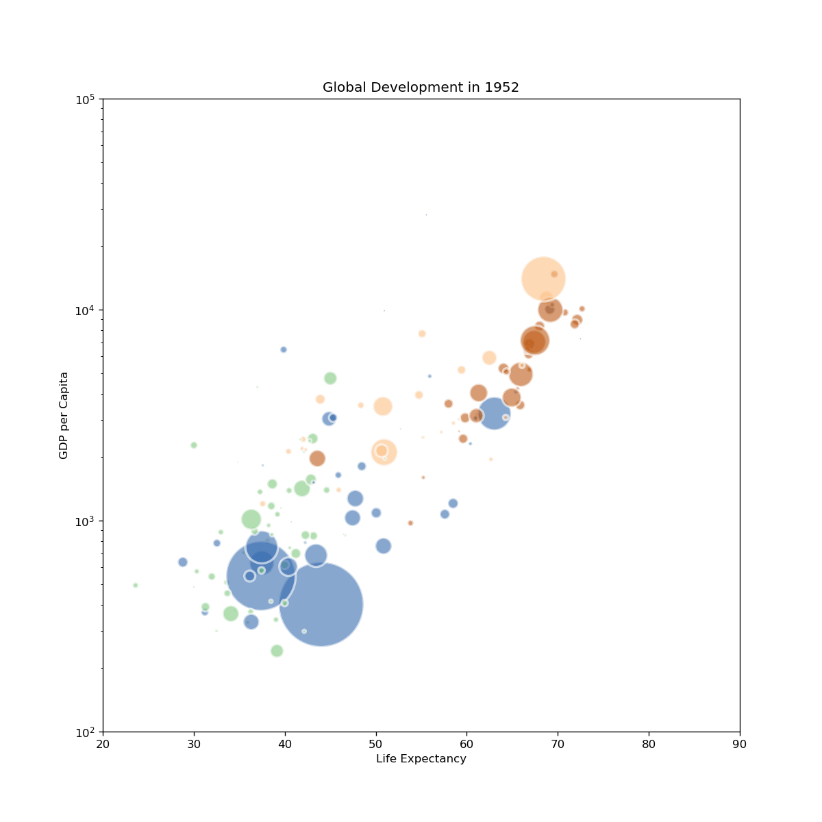
SENCE 2025 Examples
import insel
insel.block('sum', 2, 3)
5.0
insel.block('do', parameters=[1, 10, 1])
[1.0, 2.0, 3.0, 4.0, 5.0, 6.0, 7.0, 8.0, 9.0, 10.0]
insel.block('gain', 2, 5, 7, parameters=[3], outputs=3)
[6.0, 15.0, 21.0]
insel.template('x_times_y.vseit', x=2, y=4)
8.0
streamlit
# save to web_app.py
# run with:
# streamlit run my_web_app.py
import streamlit as st
import insel
st.title("INSEL online")
x = st.slider("X", 0, 100, 25)
y = st.slider("Y", 0, 100, 25)
result = insel.block('SUM', x, y)
st.write(f"{x} + {y} = {result}")
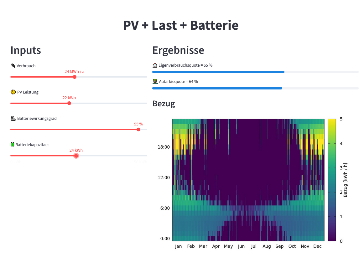
import insel
import streamlit as st
st.set_page_config(layout="wide", page_title="PV + Last + Batterie")
st.markdown(
"<h1 style='text-align: center'>PV + Last + Batterie</h1>", unsafe_allow_html=True
)
left, right = st.columns([2, 3])
with left:
st.header("Inputs")
verbrauch = st.slider("🔌 Verbrauch", 1, 50, 10, format="%g MWh / a")
pvleistung = st.slider("🌞 PV Leistung", 1, 50, 10, format="%g kWp")
wirkungsgrad = st.slider("🦾 Batteriewirkungsgrad", 1, 100, 95, format="%g %%")
kapazitaetbatterie = st.slider("🔋 Batteriekapazitaet", 0, 50, 5, format="%g kWh")
with right:
st.header("Ergebnisse")
eigenverbrauchsquote, autarkiequote, cycles = insel.template(
"Last_PV_Batterie.vseit",
MWh_Verbrauch=verbrauch,
kWp_PV=pvleistung,
Kapazitaet_Batterie=kapazitaetbatterie,
Wirkungsgrad_Batterie=wirkungsgrad / 100,
)
st.progress(
eigenverbrauchsquote,
text=f"🏠 Eigenverbrauchsquote = {eigenverbrauchsquote*100:.0f} %",
)
st.progress(
autarkiequote,
text=f"🏝️ Autarkiequote = {autarkiequote*100:.0f} %",
)
st.badge(f"{cycles:.0f} Zyklen / a")
st.subheader("Bezug")
# NOTE: Could add a random id, for multi-users
st.image("/tmp/Last_PV_Batterie.png")
random facts
import requests
# Example: API for a random fact
url = "https://uselessfacts.jsph.pl/random.json?language=en"
response = requests.get(url)
if response.status_code == 200:
data = response.json()
print("💡 Did you know?")
print(data['text'])
else:
print("Could not fetch the fact.")
💡 Did you know? Humans use a total of 72 different muscles in speech.
rich
from rich.progress import track
import time
for i in track(range(20), description="Hacking NASA..."):
time.sleep(0.1) # Simulate work
Output()
prettymapp
from prettymapp.geo import get_aoi
from prettymapp.osm import get_osm_geometries
from prettymapp.plotting import Plot
from prettymapp.settings import STYLES
aoi = get_aoi(
# Location can either be defined by coordinates:
coordinates=(45.43900, 12.32625),
# or an address:
# address="Praça Ferreira do Amaral, Macau",
radius=1500,
rectangular=False,
)
df = get_osm_geometries(aoi=aoi)
fig = Plot(
df=df,
aoi_bounds=aoi.bounds,
draw_settings=STYLES["Citrus"],
credits=False,
).plot_all()
fig.set_dpi(120)
# If you want to save it to a PNG file, with 3600x3600px
# fig.savefig("images/venice.png", dpi=300)

Satellite images
from IPython.display import Image
Image(filename='images/houat.png')

pandas
import pandas as pd
pd.read_csv('https://web.stanford.edu/class/archive/cs/cs109/cs109.1166/stuff/titanic.csv')
| Survived | Pclass | Name | Sex | Age | Siblings/Spouses Aboard | Parents/Children Aboard | Fare | |
|---|---|---|---|---|---|---|---|---|
| 0 | 0 | 3 | Mr. Owen Harris Braund | male | 22.0 | 1 | 0 | 7.2500 |
| 1 | 1 | 1 | Mrs. John Bradley (Florence Briggs Thayer) Cum... | female | 38.0 | 1 | 0 | 71.2833 |
| 2 | 1 | 3 | Miss. Laina Heikkinen | female | 26.0 | 0 | 0 | 7.9250 |
| 3 | 1 | 1 | Mrs. Jacques Heath (Lily May Peel) Futrelle | female | 35.0 | 1 | 0 | 53.1000 |
| 4 | 0 | 3 | Mr. William Henry Allen | male | 35.0 | 0 | 0 | 8.0500 |
| ... | ... | ... | ... | ... | ... | ... | ... | ... |
| 882 | 0 | 2 | Rev. Juozas Montvila | male | 27.0 | 0 | 0 | 13.0000 |
| 883 | 1 | 1 | Miss. Margaret Edith Graham | female | 19.0 | 0 | 0 | 30.0000 |
| 884 | 0 | 3 | Miss. Catherine Helen Johnston | female | 7.0 | 1 | 2 | 23.4500 |
| 885 | 1 | 1 | Mr. Karl Howell Behr | male | 26.0 | 0 | 0 | 30.0000 |
| 886 | 0 | 3 | Mr. Patrick Dooley | male | 32.0 | 0 | 0 | 7.7500 |
887 rows × 8 columns
pd.read_csv('http://ultra.ericduminil.com/data/all_ultras.csv', sep=';')
| id | name | miles | division | laps | discipline | country | age | elapsed_time | kilometers | venue | year | |
|---|---|---|---|---|---|---|---|---|---|---|---|---|
| 0 | miami_2025_151 | Joe Mazzone | 320.29200 | Open | 217 | Push | US | 30-39 | 23.92384 | 515.460 | Miami Ultra | 2025 |
| 1 | miami_2021_49 | Joe Mazzone | 313.90000 | Open | 215 | Push | US | 30-39 | 23.64750 | 505.173 | Miami Ultra | 2021 |
| 2 | dutch_2017_13 | Rick Pronk | 313.17108 | Open | 160 | Push | NL | 1-49 | 23.95963 | 504.000 | Dutch Ultra | 2017 |
| 3 | dutch_2018_18 | Rick Pronk | 311.21376 | Open | 159 | Push | NL | 1-49 | 23.91601 | 500.850 | Dutch Ultra | 2018 |
| 4 | miami_2016_201 | Andrew Andras | 309.52000 | Open | 212 | Push | US | 30-39 | 23.96444 | 498.124 | Miami Ultra | 2016 |
| ... | ... | ... | ... | ... | ... | ... | ... | ... | ... | ... | ... | ... |
| 1569 | miami_2015_256 | Jennifer Gonzalez | 7.30000 | Women | 5 | Push | US | 19-29 | 8.89917 | 11.748 | Miami Ultra | 2015 |
| 1570 | miami_2019_26 | Zack Knezevic | 7.30000 | Open | 5 | Push | US | 30-39 | 17.43500 | 11.748 | Miami Ultra | 2019 |
| 1571 | miami_2025_138 | Scott Ziegler | 5.90400 | Open | 4 | Push | US | 40-49 | 23.14916 | 9.502 | Miami Ultra | 2025 |
| 1572 | miami_2022_132 | Zack K | 2.92000 | Open | 2 | Push | World | 40-49 | 13.85972 | 4.699 | Miami Ultra | 2022 |
| 1573 | miami_2023_64 | Leonard L Leffler | 1.46000 | Open | 1 | Paddle | US | 50-59 | 23.00992 | 2.350 | Miami Ultra | 2023 |
1574 rows × 12 columns
import xarray as xr
# from https://berkeleyearth.org/data/
ds = xr.open_dataset("~/Downloads/Land_and_Ocean_LatLong1.nc")
ds
<xarray.Dataset>
Dimensions: (longitude: 360, latitude: 180, time: 2100, month_number: 12)
Coordinates:
* longitude (longitude) float32 -179.5 -178.5 -177.5 ... 177.5 178.5 179.5
* latitude (latitude) float32 -89.5 -88.5 -87.5 -86.5 ... 87.5 88.5 89.5
* time (time) float64 1.85e+03 1.85e+03 ... 2.025e+03 2.025e+03
Dimensions without coordinates: month_number
Data variables:
land_mask (latitude, longitude) float64 ...
temperature (time, latitude, longitude) float32 ...
climatology (month_number, latitude, longitude) float32 ...
Attributes:
Conventions: Berkeley Earth Internal Convention (based on CF-1.5)
title: Native Format Berkeley Earth Surface Temperature A...
history: 09-Jan-2025 20:35:17
institution: Berkeley Earth Surface Temperature Project
land_source_history: 04-Jan-2025 19:11:11
ocean_source_history: 06-Jan-2025 11:47:59
comment: This file contains Berkeley Earth surface temperat...ds.sel(longitude=9, latitude=48.7, method='nearest')['temperature'].plot();

ds.sel(time=2003 + 7.5 / 12, method='nearest').sel(latitude=slice(35, 65), longitude=slice(-10,30))['temperature'].plot();

ds.climatology.sel(month_number=0).plot();

stuttgart = ds.sel(longitude=9, latitude=48.7, method='nearest')
stuttgart
<xarray.Dataset>
Dimensions: (time: 2100, month_number: 12)
Coordinates:
longitude float32 9.5
latitude float32 48.5
* time (time) float64 1.85e+03 1.85e+03 ... 2.025e+03 2.025e+03
Dimensions without coordinates: month_number
Data variables:
land_mask float64 ...
temperature (time) float32 ...
climatology (month_number) float32 ...
Attributes:
Conventions: Berkeley Earth Internal Convention (based on CF-1.5)
title: Native Format Berkeley Earth Surface Temperature A...
history: 09-Jan-2025 20:35:17
institution: Berkeley Earth Surface Temperature Project
land_source_history: 04-Jan-2025 19:11:11
ocean_source_history: 06-Jan-2025 11:47:59
comment: This file contains Berkeley Earth surface temperat...import numpy as np
months = (np.floor((stuttgart.time - np.floor(stuttgart.time))*12)).astype(int)
df = pd.DataFrame({
'year': np.floor(stuttgart.time).astype(int),
'month': months + 1,
'temperature': stuttgart.climatology[months] + stuttgart.temperature,
},
)
df
| year | month | temperature | |
|---|---|---|---|
| 0 | 1850 | 1 | -2.558053 |
| 1 | 1850 | 2 | 5.262820 |
| 2 | 1850 | 3 | 2.164932 |
| 3 | 1850 | 4 | 8.349158 |
| 4 | 1850 | 5 | 10.533581 |
| ... | ... | ... | ... |
| 2095 | 2024 | 8 | 20.524185 |
| 2096 | 2024 | 9 | 15.114173 |
| 2097 | 2024 | 10 | 12.679502 |
| 2098 | 2024 | 11 | 7.373162 |
| 2099 | 2024 | 12 | 4.583126 |
2100 rows × 3 columns
df.to_csv('output/stuttgart_monthly_temperatures.csv', index=False, sep='\t')
Edward R. Tufte, The Visual Display of Quantitative Information
Book: https://www.edwardtufte.com/book/the-visual-display-of-quantitative-information/
# From https://www.ajnisbet.com/blog/tufte-in-matplotlib
import matplotlib.pyplot as plt
import matplotlib.ticker as ticker
# Global options.
plt.rcParams['font.family'] = 'serif'
# Data from p74 of Visual Display of Quantitative Information.
x = list(range(1951, 1960))
y = [264, 231, 274, 241, 322, 286, 283, 247, 243]
# Plot line, line masks, then dots.
fig, ax = plt.subplots()
ax.plot(x, y, linestyle='-', color='black', linewidth=1, zorder=1)
ax.scatter(x, y, color='white', s=100, zorder=2)
ax.scatter(x, y, color='black', s=20, zorder=3)
# Remove axis lines.
ax.spines['top'].set_visible(False)
ax.spines['right'].set_visible(False)
# Set spine extent.
ax.spines['bottom'].set_bounds(min(x), max(x))
ax.spines['left'].set_bounds(225, 325)
# Reduce tick spacing.
x_ticks = list(range(min(x), max(x)+1, 2))
ax.xaxis.set_ticks(x_ticks)
ax.yaxis.set_major_locator(ticker.MultipleLocator(base=25))
ax.tick_params(direction='in')
# Adjust lower limits to let data breathe.
ax.set_xlim([1950, ax.get_xlim()[1]])
ax.set_ylim([210, ax.get_ylim()[1]])
# Axis labels as a title annotation.
ax.text(1958, 320, 'Connecticut Traffic Deaths,\n1951 - 1959')
plt.show();

